HOLONIS
Media Uploader for Mobile Native
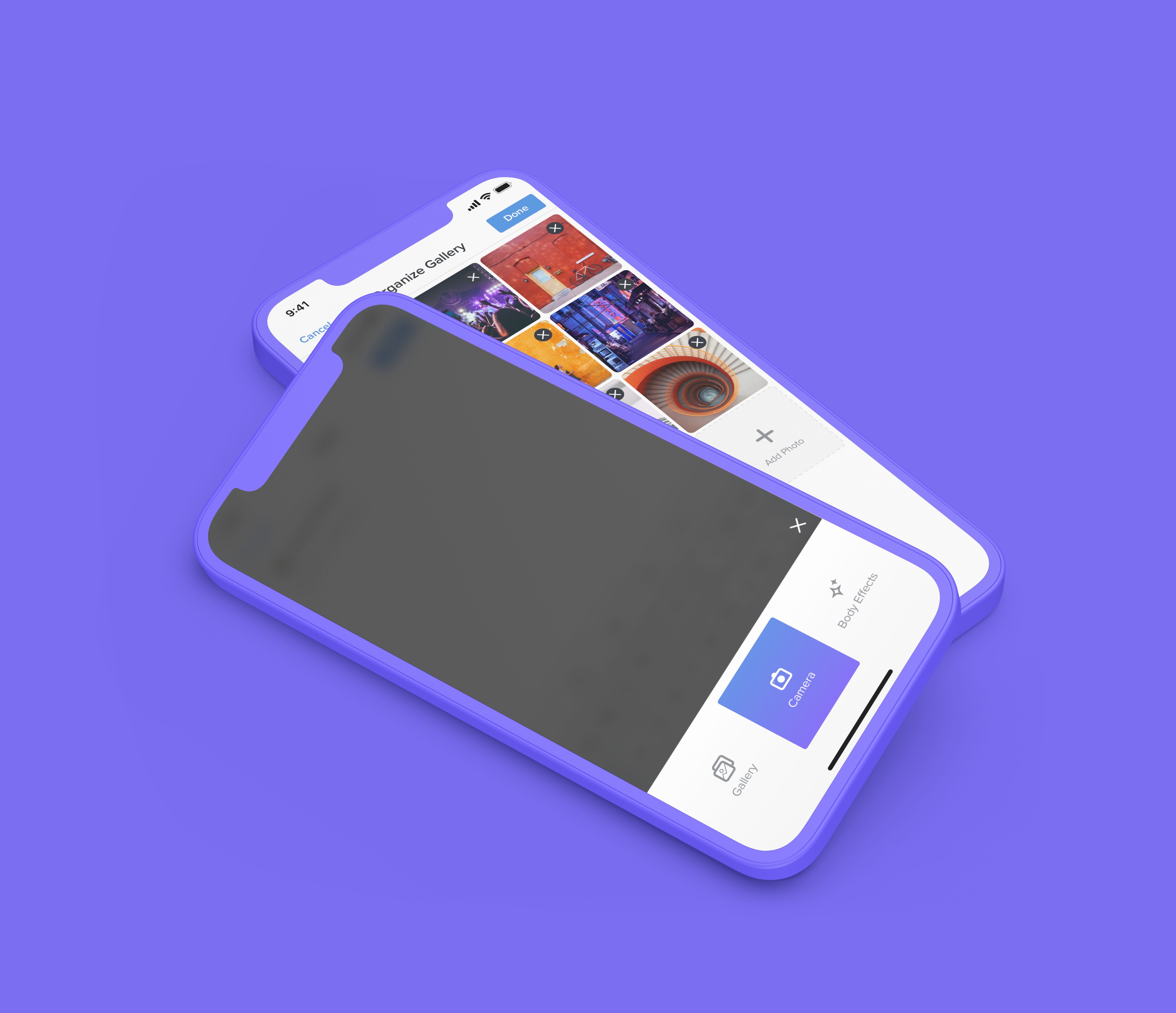
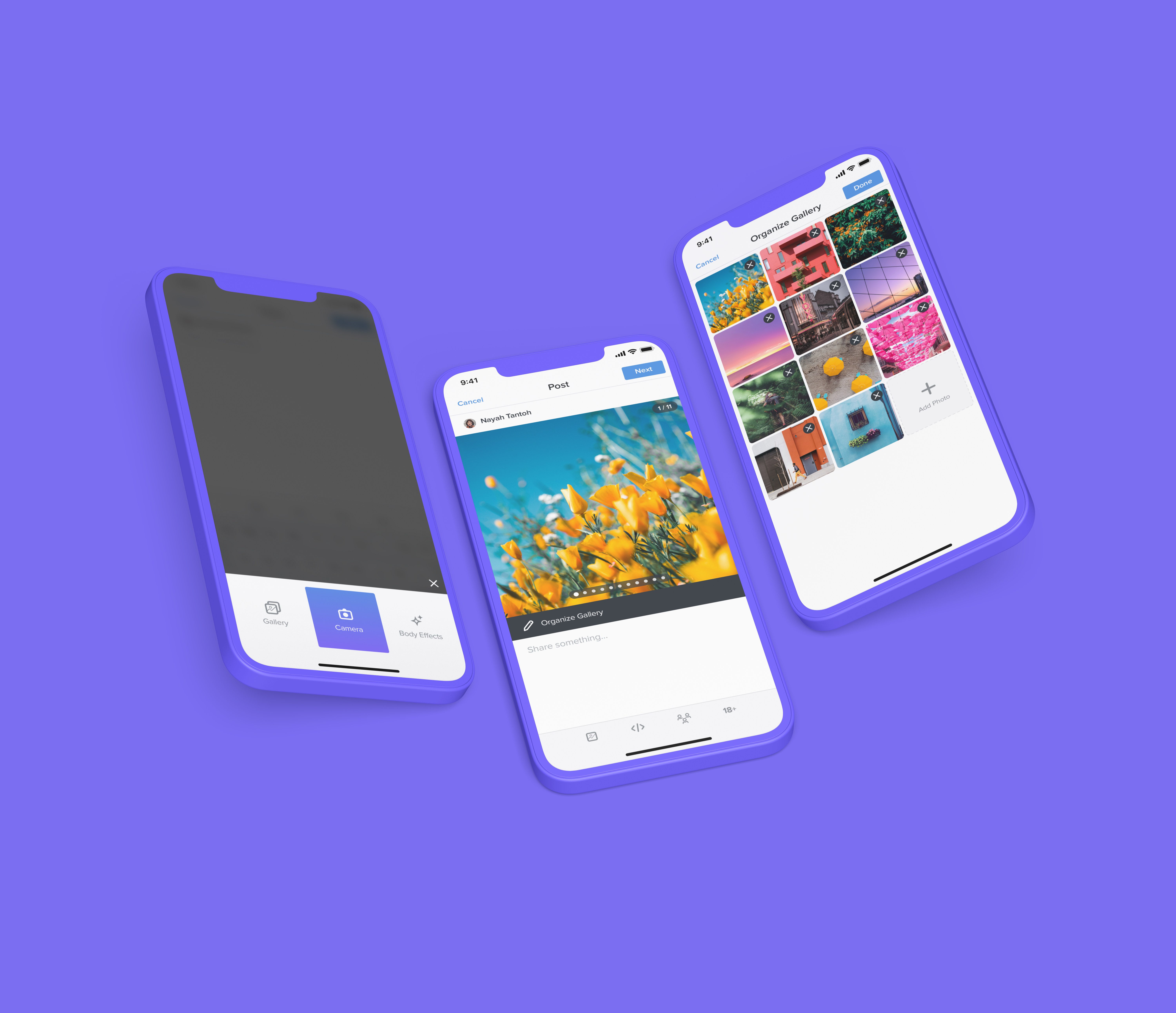
Holonis is a new social media platform that lets anyone build their brand, connect with an audience, or enjoy content from their favorite creators. You can create a variety of content, including photo or text posts. For this project, I was tasked with updating the post creation flow to allow users to easily upload multiple photos or videos to a post, as well as easily rearrange their uploaded media.
01
My Role
I was the main designer on this project, and I frequently received feedback and help from 2 senior designers, as well as other developers on the product team. I was responsible for doing competitive analysis, user flow, wire framing, and user interface design. This project was completed over the course of about a month. Unfortunately due to time and resource constraints, we were not able to do extensive user testing or research.
02
The Problem
Currently, you're only able to upload one photo or video to a post at a time. Compared to other platforms where you can view posts with a lot of media, this felt really limiting to users.
We had also recently integrated a new feature called "Body Effects" that lets you edit the backgrounds of photos of yourself. We wanted to make it so you could also choose to add photos straight from this feature when you go through the post creation flow (in addition to choosing from your phone gallery or camera).

PREVIOUS MEDIA UPLOADER DESIGNS | DRAG SLIDER UP TO COMPARE WITH UPDATED DESIGNS
03
The Goals
- Allow users to upload multiple photos or videos to a new post, as opposed to just one.
- Add the ability to choose to upload from the Phone Gallery, Camera, or the newly integrated Body Effects feature.
- Make it easy for users to rearrange uploaded photos, as well as delete or add more.
- Let users view all media in published posts on the news feed.
04
Explorations
For my competitor analysis, I looked at platforms like Instagram, Twitter, and Tumblr, as well as messaging platforms such as Google Messages to see how they handled multiple media uploads from different sources. I also tried to pay attention to different methods of rearranging media and looked at other platforms such as Facebook, Bumble and Tinder for inspiration.
04.1
Media Upload Flow
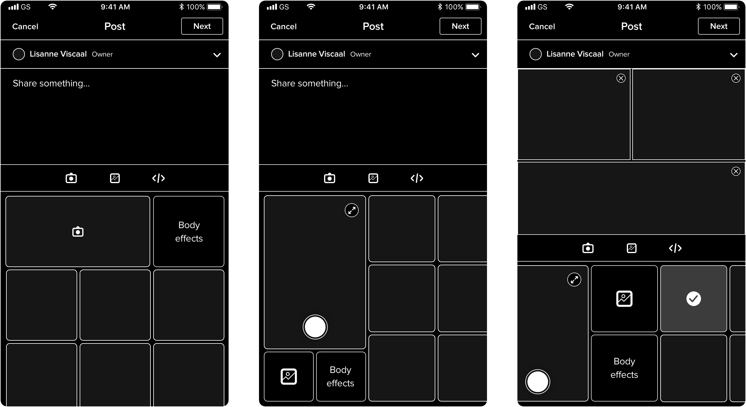
I started by exploring how to select and upload photos from the camera, gallery, or Body Effects on the initial post creation screen. I wanted to make sure the process would be as straightforward and convenient as possible. I mocked up three main approaches to see if they could be a good fit for us.
Approach 1: When creating a new post, the user automatically sees the most recent photos from their phone gallery at the bottom of the text field so they can choose and upload those more quickly. If the user wants to either take a new photo or select from their entire gallery, they can select the camera or gallery icon in toolbar below. (The camera icon would additionally lead to the Body Effects feature.)
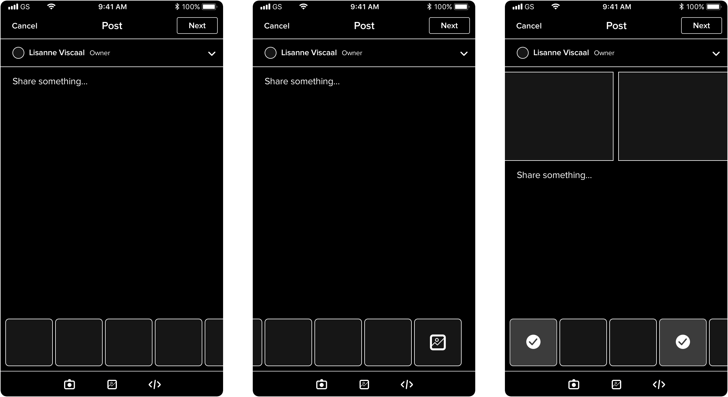
MEDIA UPLOADER EXPLORATION (APPROACH 1)
Approach 2: To add media, the user can tap the photo icon in the toolbar, and a preview of most recent photos, as well as camera/gallery/body effects buttons will populate the bottom of the screen. Tapping camera, gallery, or body effects will bring the user to each respective screen.
MEDIA UPLOADER EXPLORATIONS (APPROACH 2)
Approach 3: Tapping the photo icon in the toolbar simply opens a menu with the camera/gallery/body effects buttons that will lead to the respective screen.
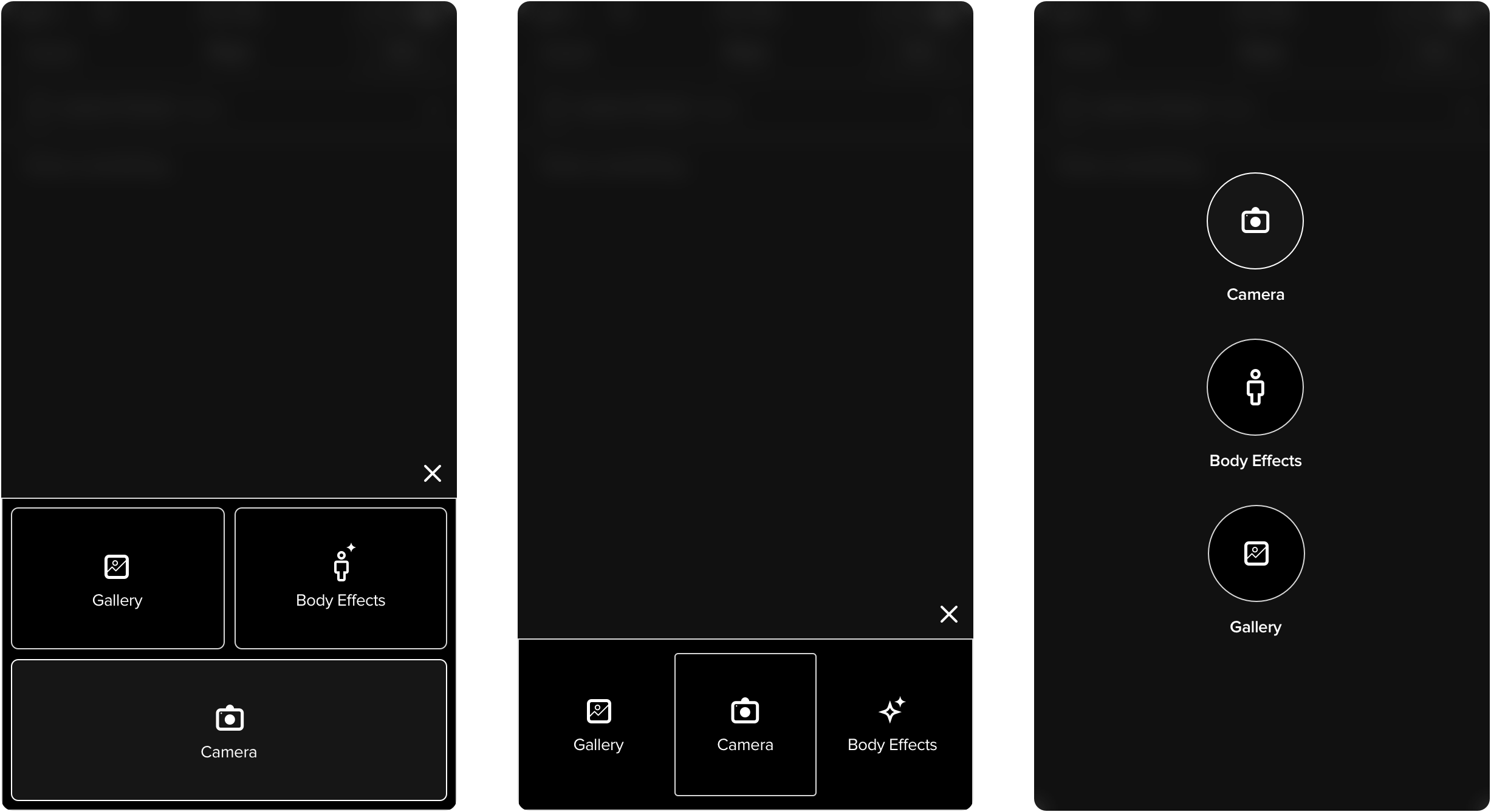
MEDIA UPLOADER EXPLORATIONS (APPROACH 3)
Our team actually quite liked Approach 2 because of how intuitive and quick it seemed. Unfortunately the effort for our small dev team would've taken the project out of scope, so we had to rule it out for now. Ultimately we decided to go with Approach 3 for its straightforwardness. We also liked that this option would not clutter up the text entry field, even after multiple photos have been selected.
04.2
Viewing, Adding, and Rearranging Media
Next, I explored how the post creation screen would function once multiple photos/videos have been selected and uploaded. In other words, how could the user be able to easily view, rearrange, delete, or add additional media? I also played around with 3 different approaches here:
Approach 1: Uploaded photos would be shown in a horizontal line in the text field, where users could touch, hold, and drag photos to rearrange them and delete photos with the "x" icon. If users wanted to add more, they could simply tap the photo icon and go through the same steps to add another photo.
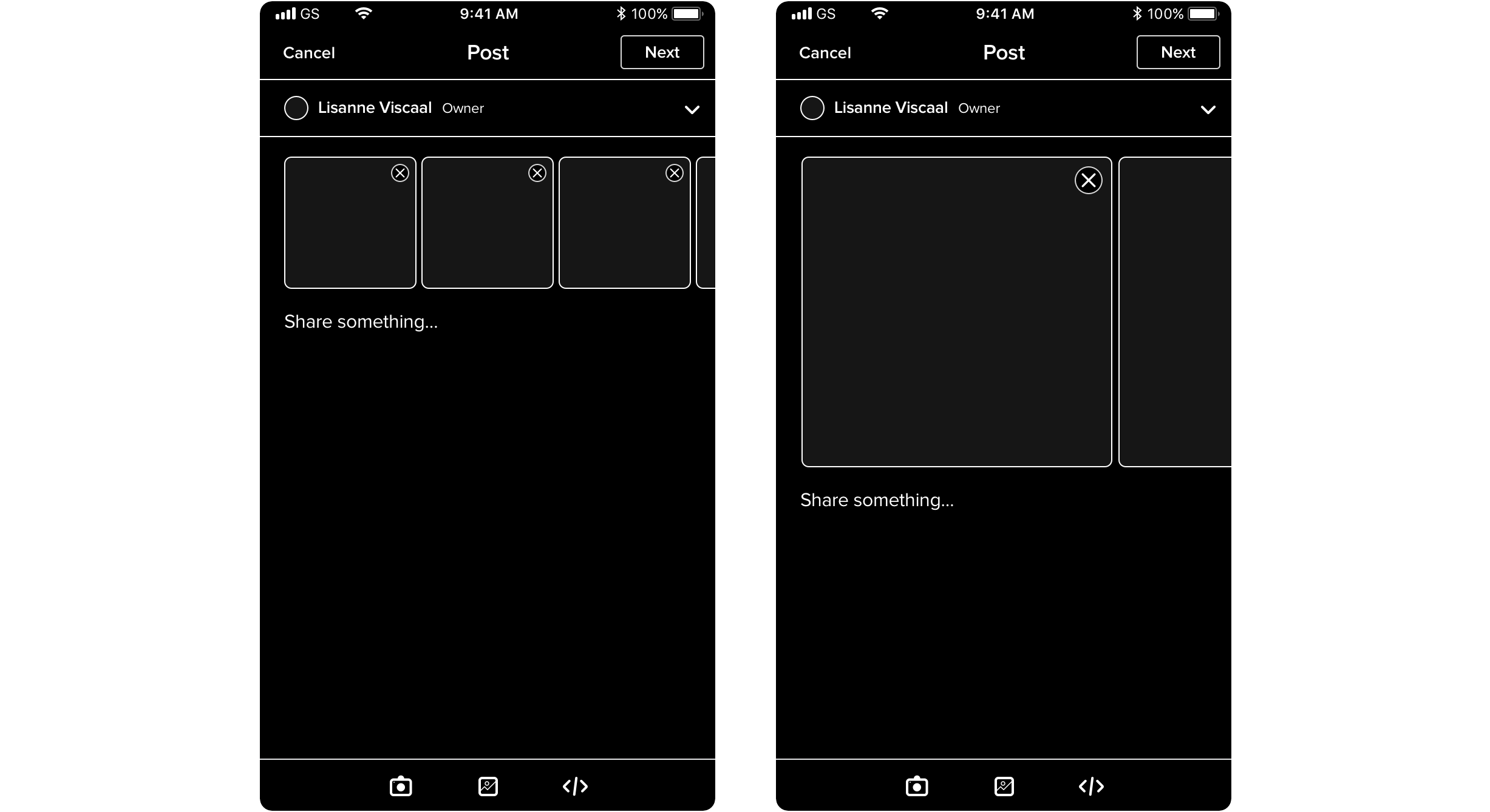
MEDIA EDITING EXPLORATION (APPROACH 1)
Approach 2: A maximum of 6 selected photos would automatically be arranged in a grid formation in the text field and will be in the order the user selected them in on the gallery screen. If there are more than 6, the grid will display a "+3" tile depending on how many more photos there are. Upon tapping it, the user will be led to another screen where photos can be viewed and added or deleted.
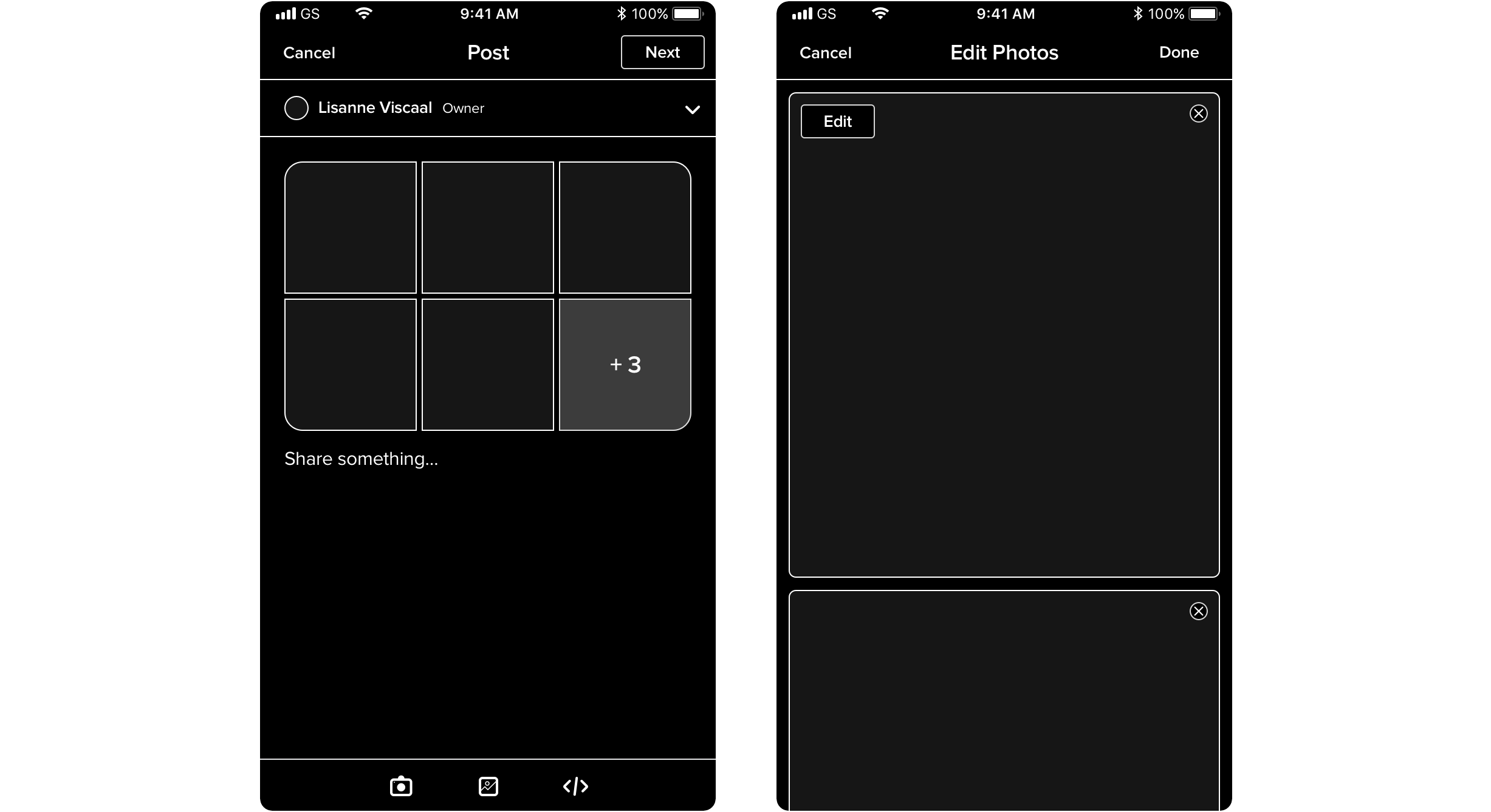
MEDIA EDITING EXPLORATION (APPROACH 2)
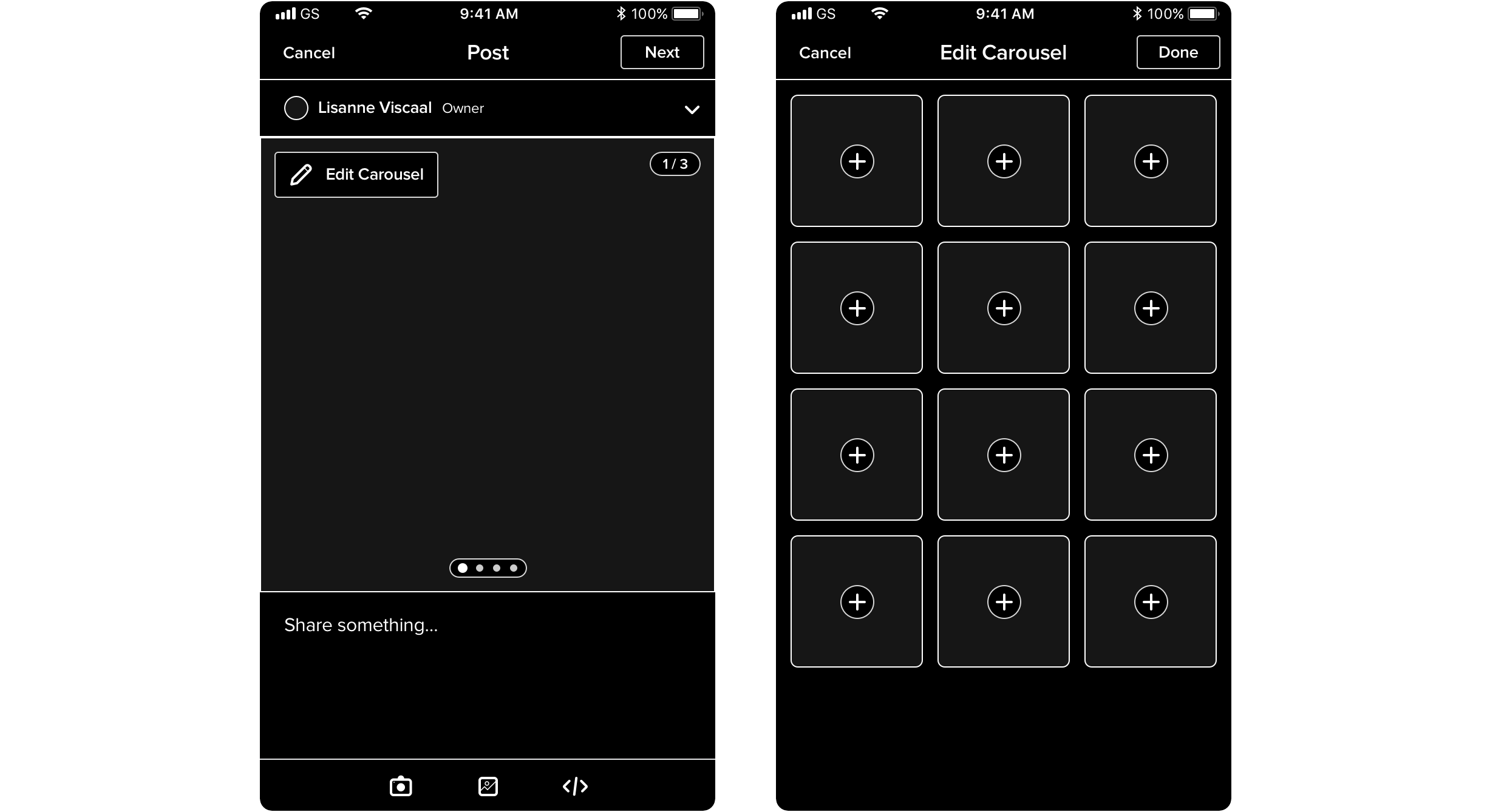
Approach 3: Uploaded photos would appear in a square-sized carousel where users can swipe to get to the next photo. There would be an "Edit" button overlaid on the carousel that leads to another screen where the user can add, delete, and drag to rearrange photos in a grid.
MEDIA EDITING EXPLORATION (APPROACH 3)
Our team ultimately decided on Approach 3. We felt it was the simplest and most visually appealing out of the three. Showing multiple smaller photo thumbnails in the text field could potentially look busy and overwhelming compared to having one square-sized carousel. With Approach 1 (where photos would be shown in a horizontal line in the text field), there was also the issue of handling multiple image ratios; it could potentially look very unbalanced if photos were different sizes. Approach 3 solved that by displaying everything as a square cropped to the center, and tapping on a photo would bring it up in its full resolution and aspect ratio. Plus, the addition of using a photo grid in a separate screen to edit the carousel photos felt more user friendly and less overwhelming.
We had also decided on setting an upload limit of 12 photos or videos. This number fit our photo grid nicely and seemed large enough that users would feel they could upload a lot, but still small enough to keep things contained.
05
The Final Solution
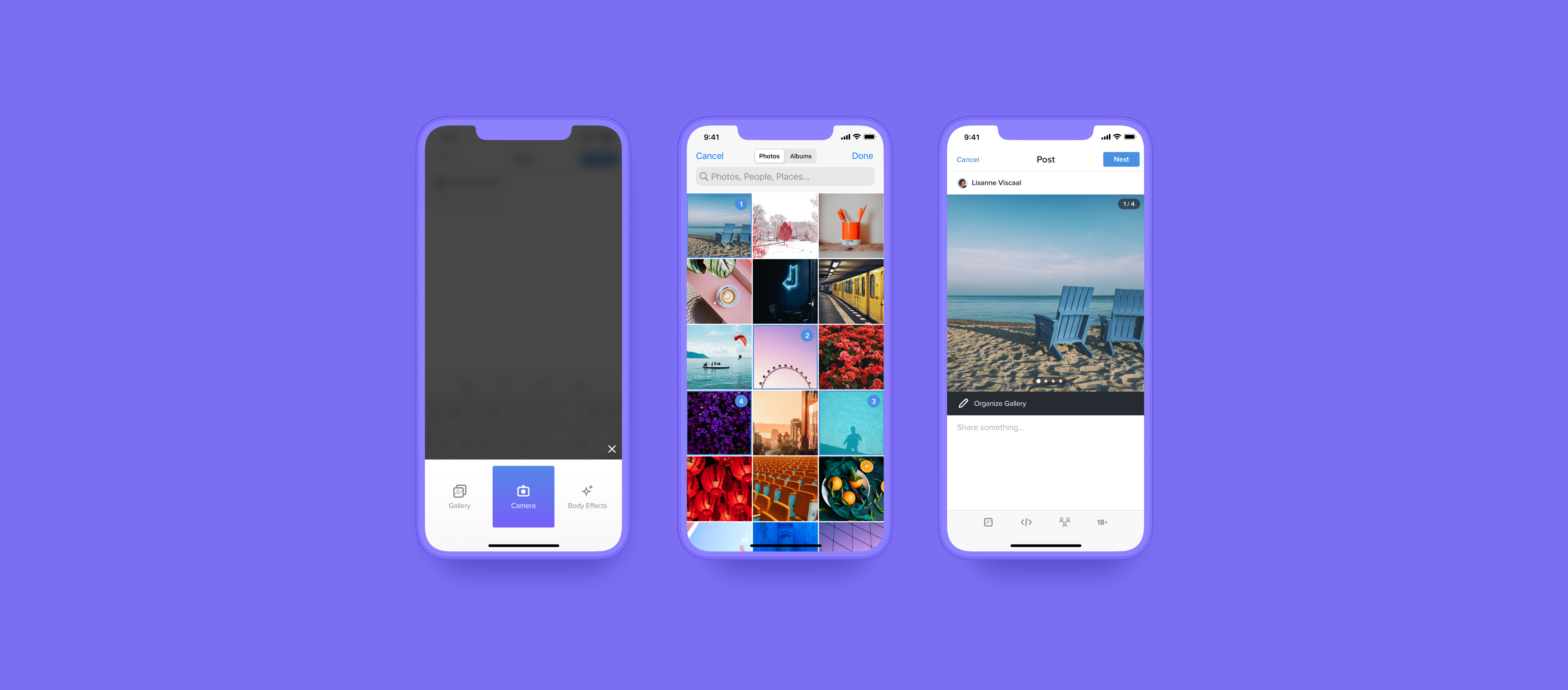
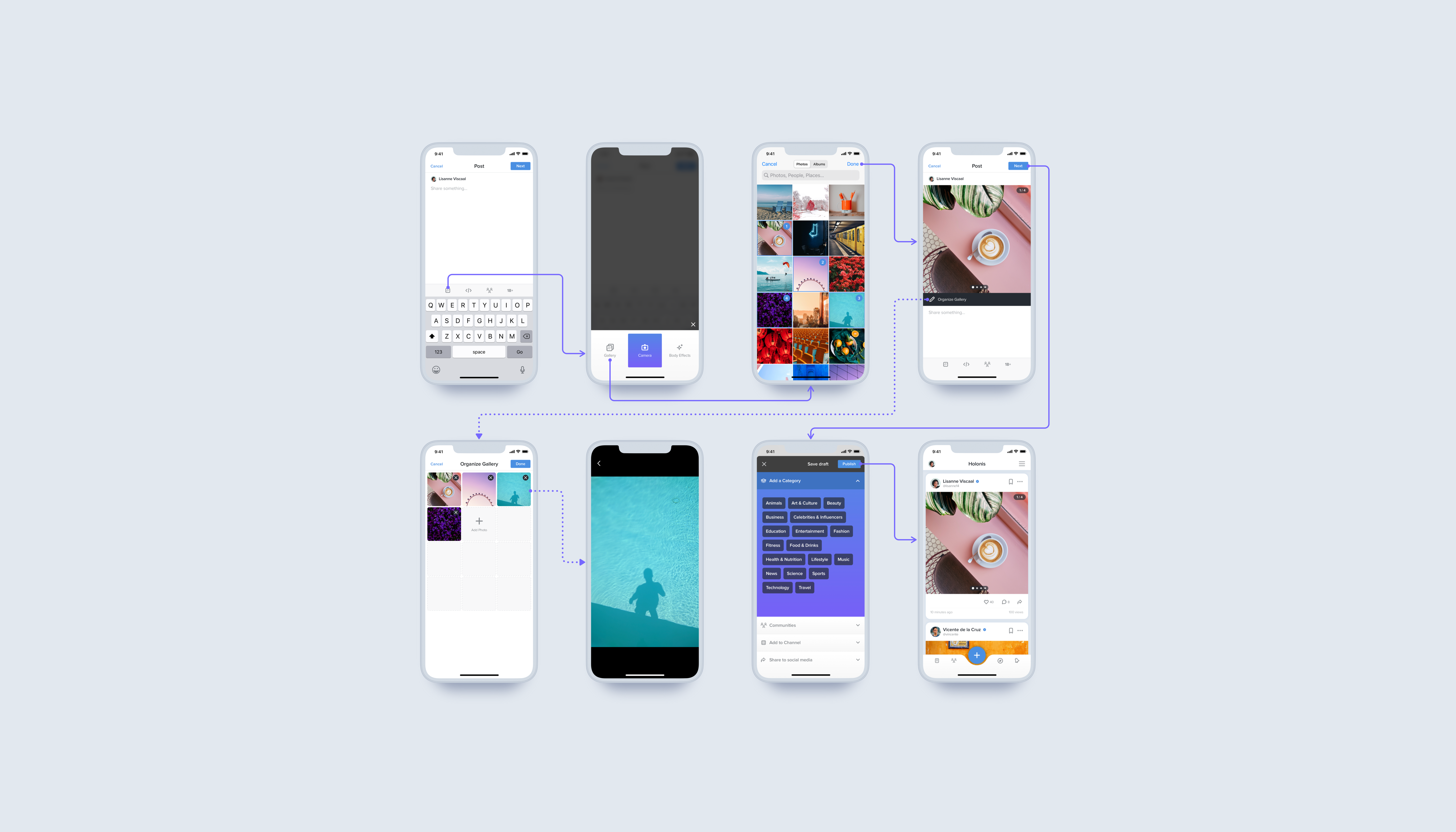
After approval from stakeholders, I further refined my explorations into what would be our final screens. The biggest visual change from the explorations was changing the “Edit” button on the photo carousel to a bar for more visibility.
Check out the final screens below!
06
Outcomes & Learnings
I learned a lot from working on this project. This was one of the first more complex projects I took on, so I learned a lot about keeping feasibility in mind. It was very important to check in with iOS and android developers while I was doing design explorations and finalizing the screens to make sure things could work as expected and not take an enormous amount of time and effort to develop.
If I could expand on this project without any constraints, I would've loved to take the visual redesigns further and be able to redo the entire post creation screen itself, as well as carry that over to the page and product creation screens. It would’ve been great to have these screens better match the fresh visual feel of the update news feed design. I also really liked the concept of the first few explorations I did that used the bottom of the screen to choose photos, and it would've been fun to explore that concept a little longer.
Unfortunately, this solution has yet to be developed, but the development team and stakeholders were really happy with both the visual updates and the new uploading flow's ease of use.
