HOLONIS
App Store Images
Holonis is a social media platform that lets anyone build their brand, connect with an audience, or enjoy content from their favorite creators. We wanted to update the images in the Apple App Store and Google Play Store to better represent our brand, our newest features, and our goals for the end user so they may be more convinced to try out our app.

01
My Role
I was the main designer on this project. I frequently received feedback and help with caption writing from 2 senior designers, other stakeholders on the product team, as well as a member of the marketing team. I was responsible for doing competitive analysis and graphic design. I worked on this project over the course of a month.
02
The Problem
Since anyone who wants to download the Holonis mobile app needs to go through the app store to do so, we wanted to make sure our preview images are interesting and attention grabbing. The last thing we’d want is for potential users to leave without downloading because they didn’t understand what Holonis was, and the preview images are the easiest and best way to convey what we’re all about.
That being said, there were a few big issues with the previous app store images. For one, the captions didn't give much of a sense of what people can expect when they start using our app or what makes us unique. The app screenshots focused on features that either weren't at their best yet or didn't make much sense to feature. In general, they were not the most visually appealing; all the images used a gray background and repetitive static phone mockups.
PREVIOUS MEDIA UPLOADER DESIGNS | DRAG SLIDER UP TO COMPARE WITH UPDATED DESIGNS
03
The Goals
- Rewrite the captions to tell a better story about what people can expect from using Holonis.
- Use screenshots that showcase our newest features - namely our new content tile designs, communities, and the OneLink feature.
- Update the visuals to be more fun and dynamic.
04
Explorations
I took a look at what other popular apps had done with their app store images, and I found a lot of them were vibrant, attention grabbing, and showcased their brand really well. Looking at the first image always made me want to scroll through all of them; I couldn't really say the same thing for ours. For my explorations, there were 3 main approaches I tried out.
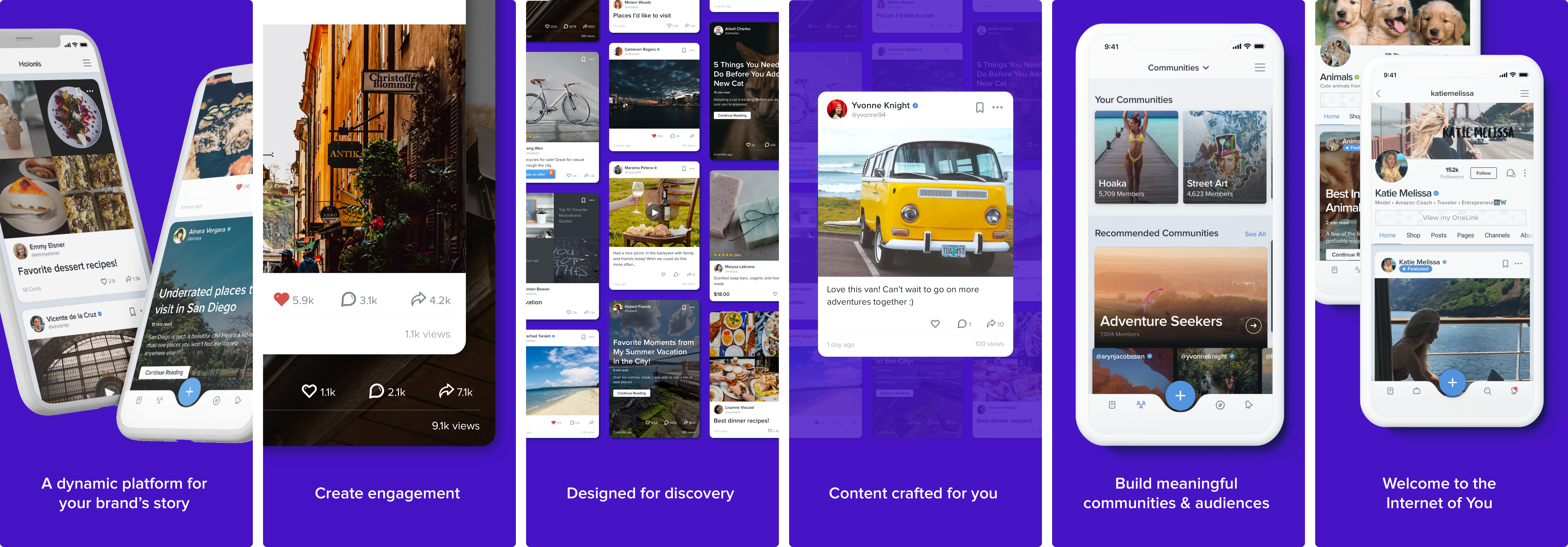
Approach 1: Visually most similar to the previous app store images, but with updated screenshots and background color. I also worked with a marketing team member who suggested shortening the captions to single words. Originally, this project was meant to be done very quickly, so this was actually the version I showed to stakeholders for approval at first. They were actually satisfied with this solution and ready to move forward with it. However after discussing it with the rest of the design team, we realized it would be a waste of an opportunity to not push these further, and I was encouraged to spend more time on them.
APP STORE IMAGE EXPLORATIONS (APPROACH 1)
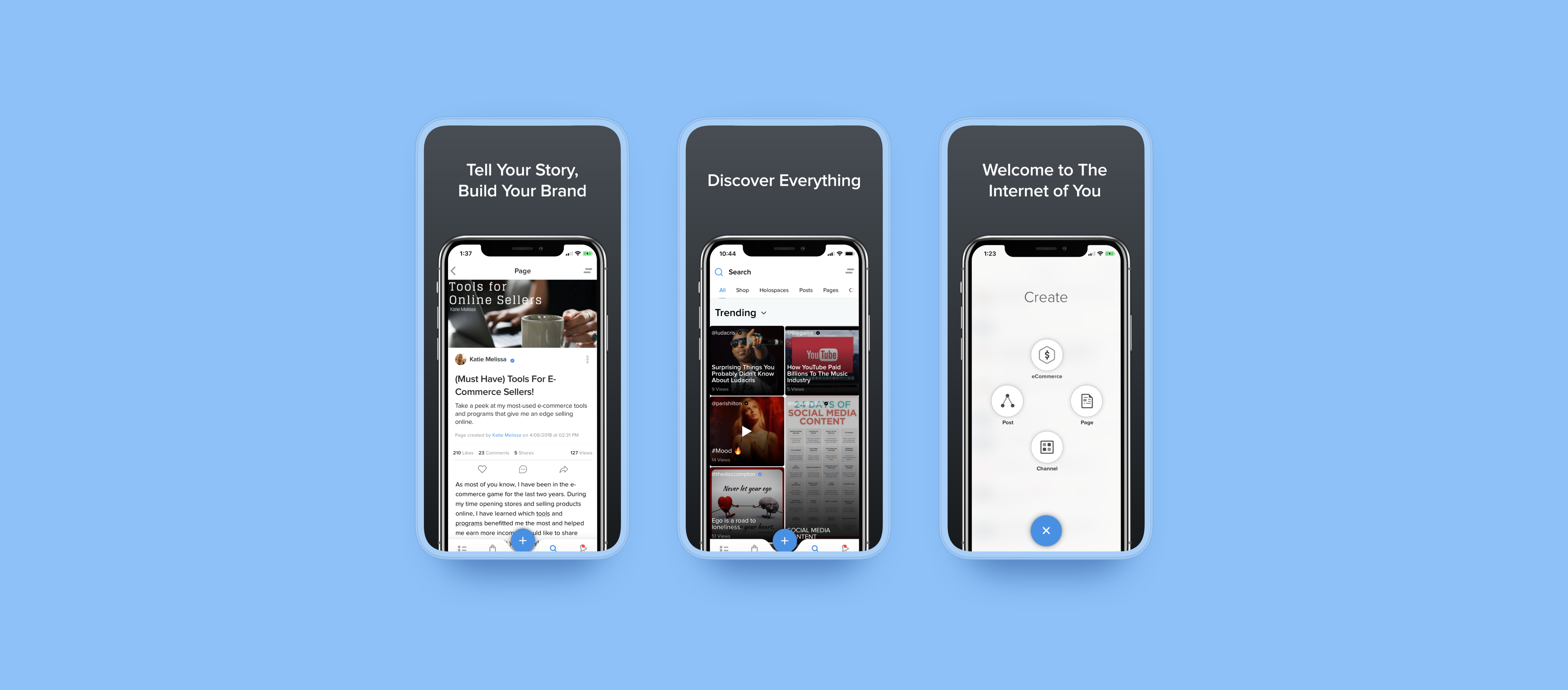
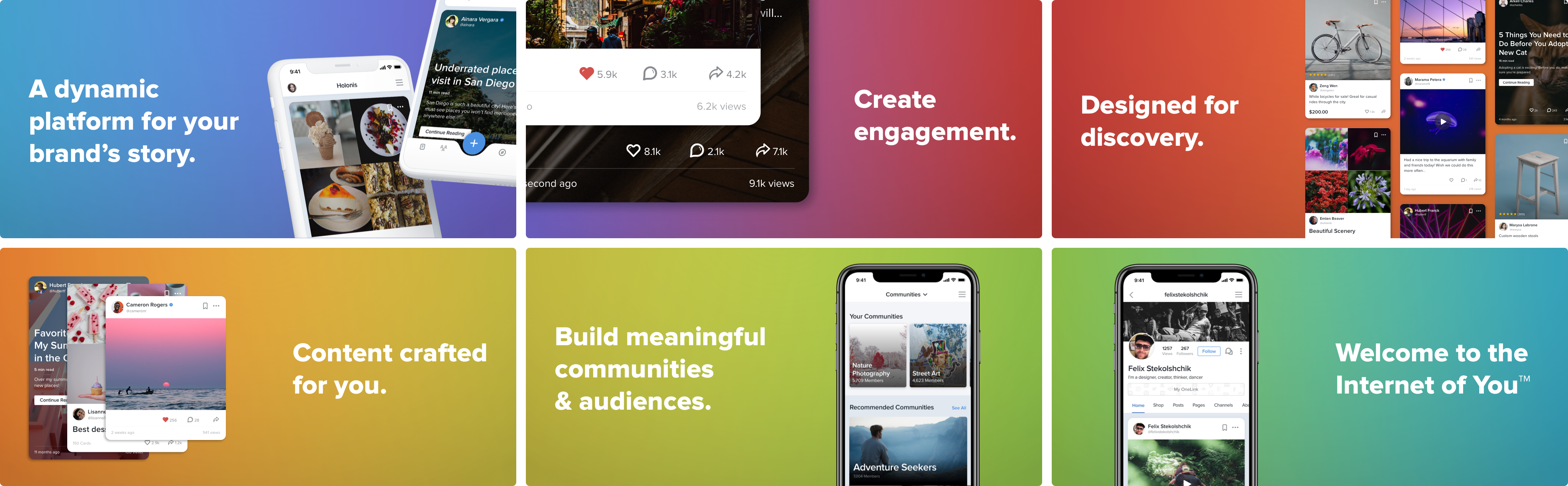
Approach 2: For my second iteration, I wanted to use phone mockups that felt varied and dynamic, since the previous iteration essentially used the same phone mockup for every screen. The majority of the images feature content tile mockups, which were the most recent visual improvement on the platform, and they did a better job at showcasing our app.
The captions went through an overhaul as well. The most important thing we wanted to keep in mind was that these images should be able to tell our story. There were a lot of iterations for the captions, until we had settled on the final ones (all thanks to Kwabe, one of the senior designers on the team, as he came up with the majority of them). Ultimately they tell users a story about what "The Internet of You" stands for - essentially, being able to build your brand so it can be discovered.
APP STORE IMAGE EXPLORATIONS (APPROACH 2)
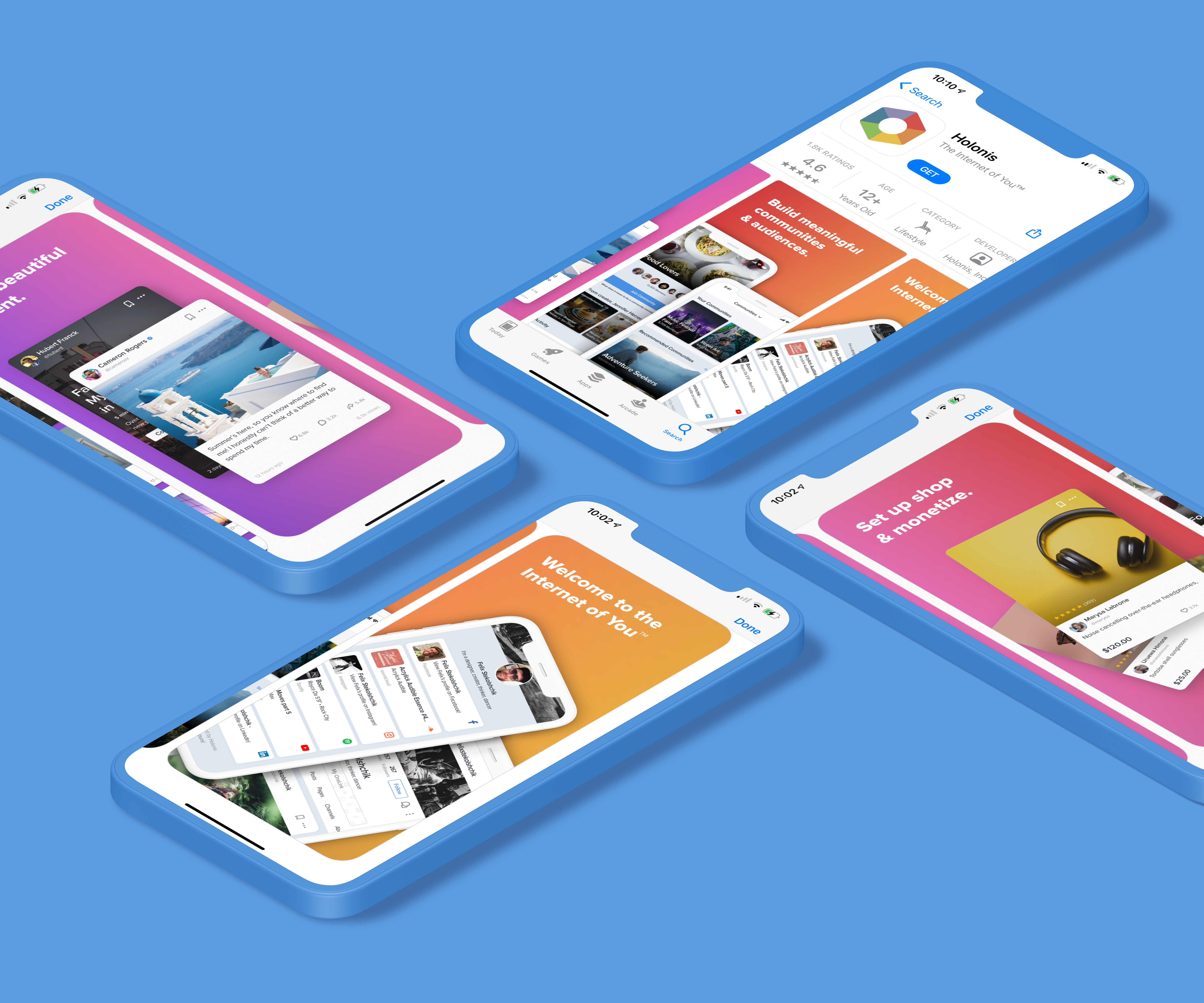
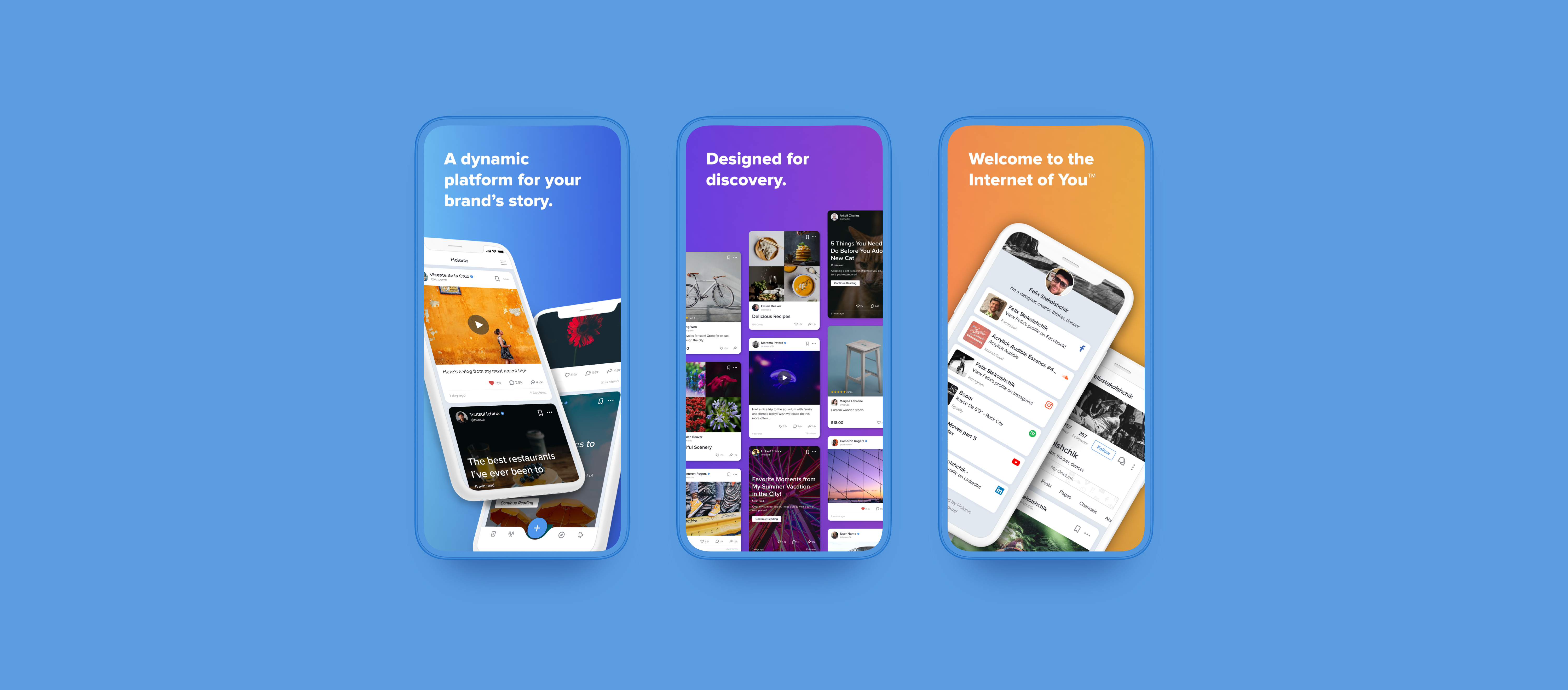
Approach 3: For my last set of explorations, I wanted to push things even further. This time, I played with having the images in a landscape orientation (as opposed to portrait). The design team fell in love with this option; we felt the elements in the images utilized the space nicely, and we liked how it placed more emphasis on the captions too.
I also really wanted these app images to be bright and fun, and I thought going for a colorful gradient background would be fitting. I had done two versions: a muted rainbow gradient using variations of Holonis’s six logo colors, and a blue-to-purple gradient similar to what we often use in our UI designs.
Ultimately, this ended up being our favorite option.
APP STORE IMAGE EXPLORATIONS, RAINBOW (APPROACH 3)
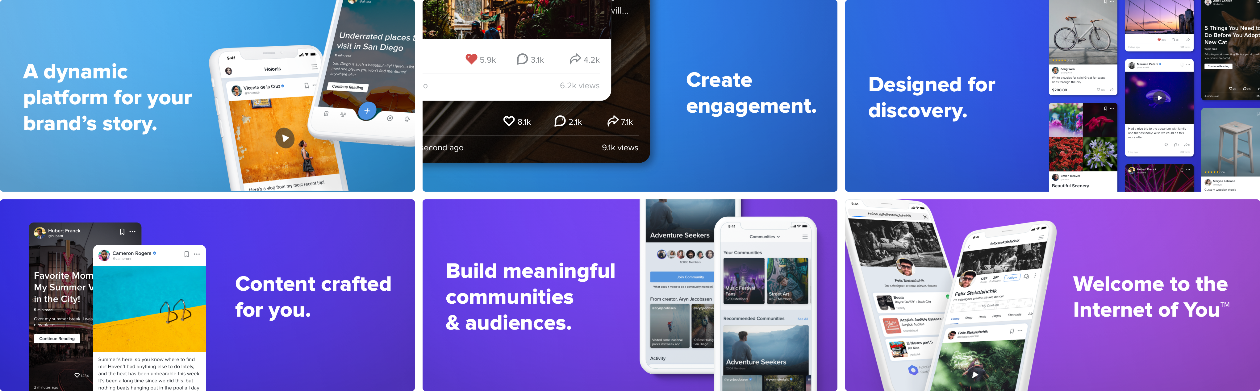
APP STORE IMAGE EXPLORATIONS, BLUE/PURPLE (APPROACH 3)
05
The Final Solution
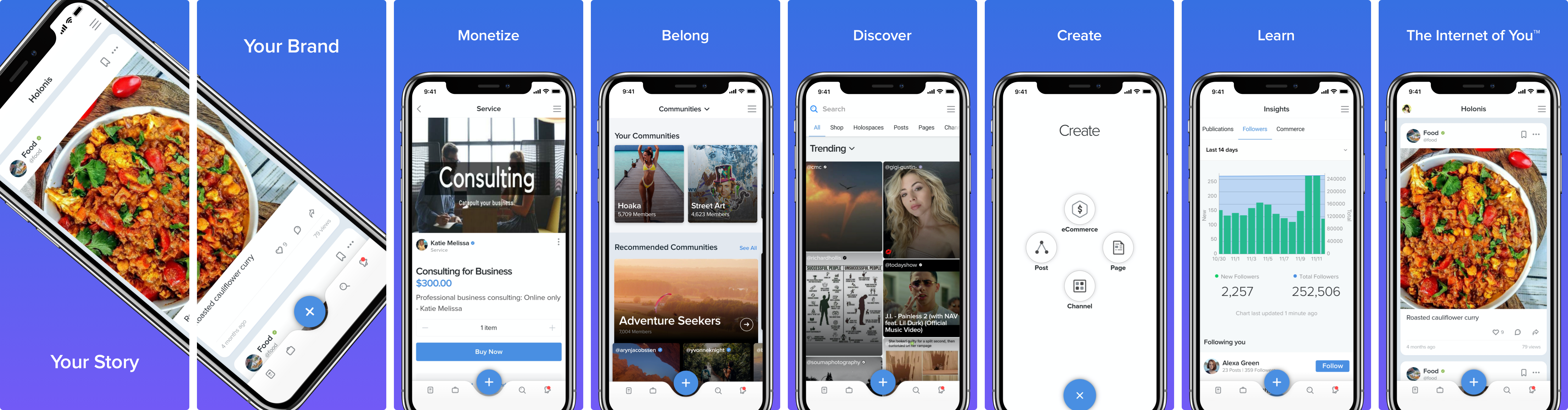
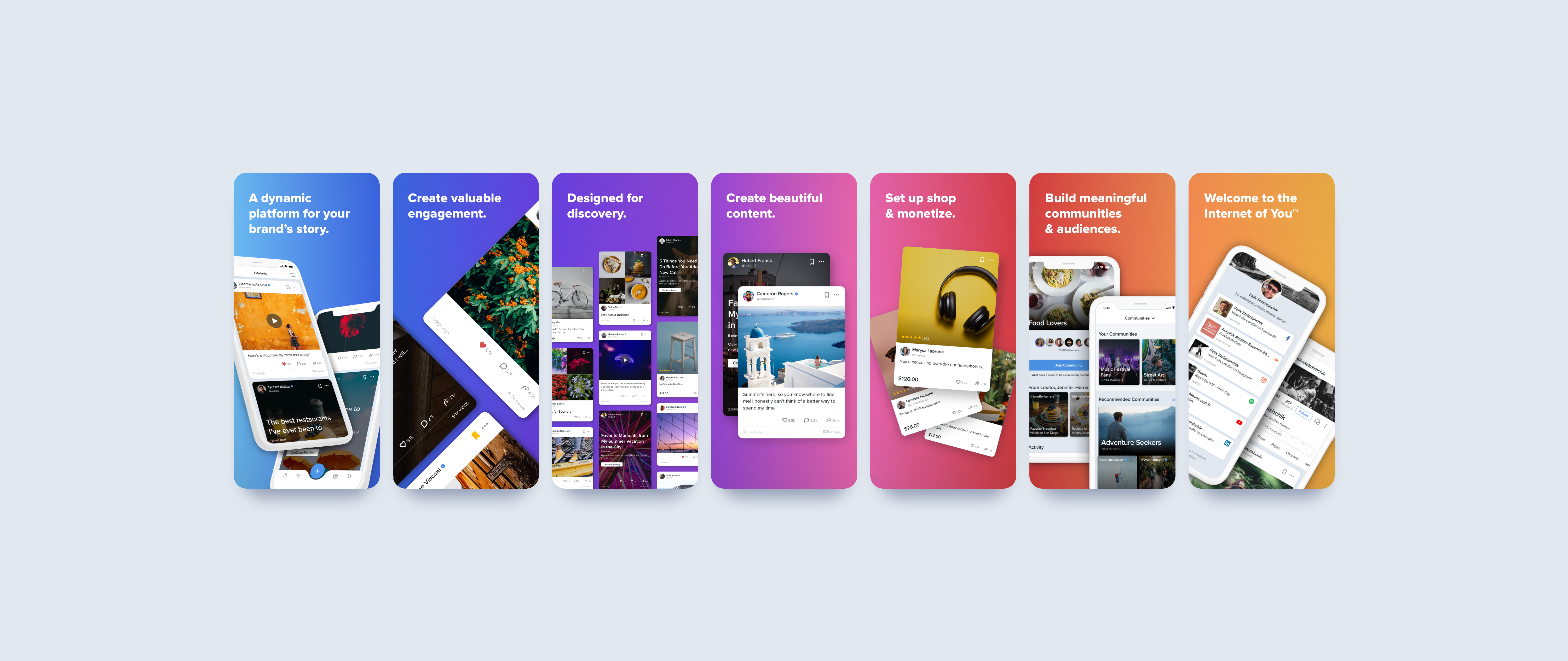
Although our design team fell in love with Approach 3, stakeholders felt that the landscape orientation was less efficient in the context of the app store because people would only see one image at a time and have to turn their phone sideways to see it full screen. In the end we agreed, so I created a portrait version. I found it was a bit more difficult to work in the portrait orientation because of how narrow it also had to be, but in the end things worked out. The captions ultimately had to be a bit smaller and the mockup layouts had to change, but we felt they worked just as well as their landscape counterparts.
For the background colors, I brightened up the rainbow gradient and adjusted it so the colors flow better from one color to the next. They’re a bit different from the brand colors, but we preferred the brighter gradient to the more muted one.
06
Outcomes & Learnings
Even though this project took a bit longer than we had expected, I found that it was challenging yet fun, and it was a great reminder to not settle for less when we don't have to. I’m very glad my team pushed me to take the time to explore more instead of settling for a result that was just “alright."
Another part of the project I didn’t know would be so challenging was redoing the captions. We needed to make sure what they said aligned with the company, and they also needed to be something we could visualize. I realized that my copywriting skills left a lot to be desired, and in the end, I needed a ton of help to be able to finalize them. Hopefully I’ll be able to work on my writing skills more in the future.
Thankfully all that hard work and attention to detail paid off, and everyone we showed them to really loved them!