HOLONIS
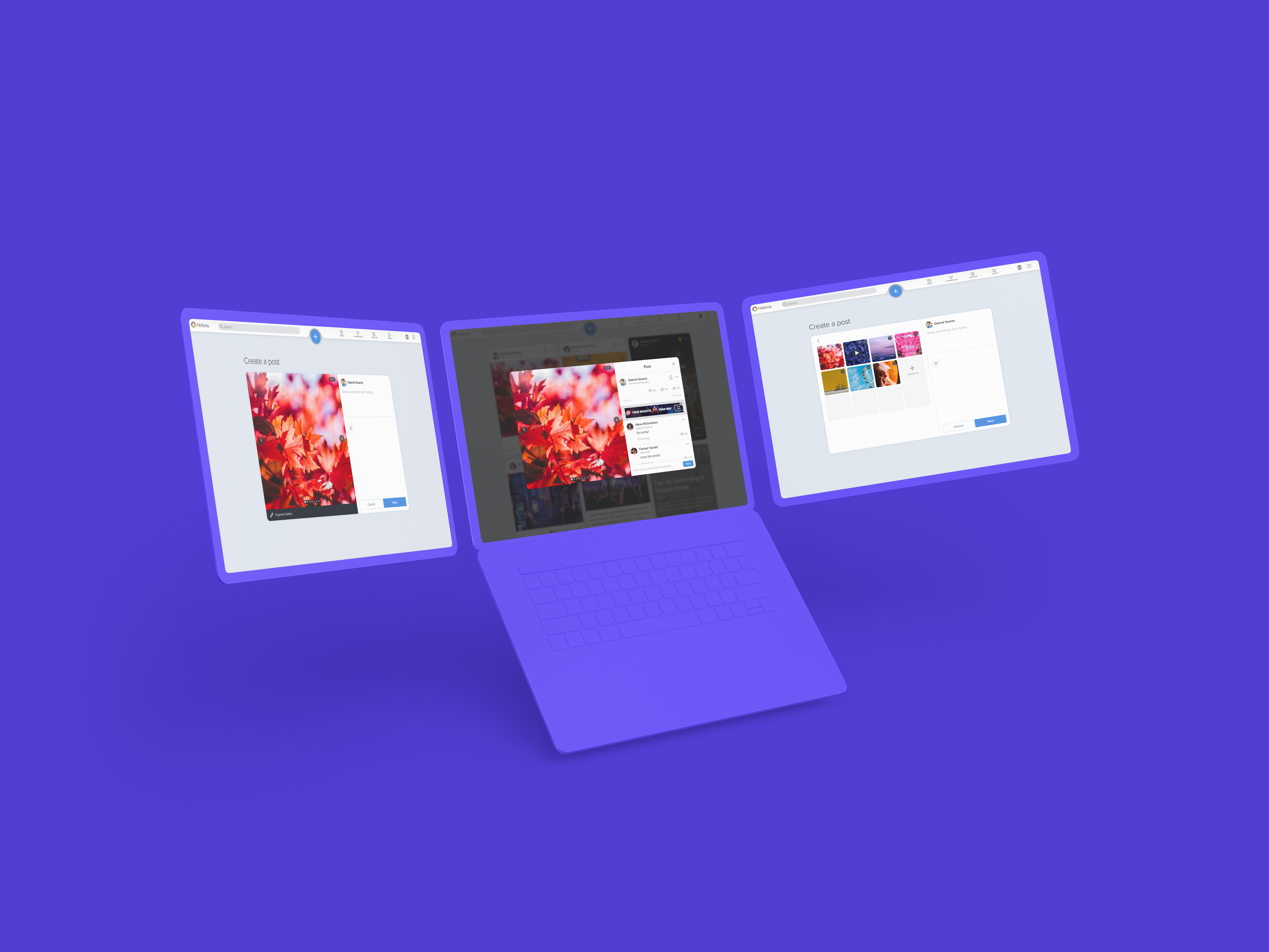
Media Uploader for Desktop Web
Holonis is a new social media platform that lets anyone build their brand, connect with an audience, or enjoy content from their favorite creators. You can create a variety of content, including photo or text posts. For this project, I was tasked with updating the post creation flow to allow users to easily upload multiple photos or videos to a post, as well as rearrange uploaded media. I previously worked on the media uploader feature for mobile native, and now it was time to work on an updated desktop web version.
01
My Role
I was the main designer on this project, and I frequently received feedback and help from 2 senior designers, as well as other developers on the product team. I was responsible for doing competitive analysis, user flow, wire framing, and user interface design. This project was completed over the course of about a month. Unfortunately due to time and resource constraints, we were not able to do extensive user testing or research.
02
The Problem
After updating the multimedia upload experience in the mobile native app, I now needed to integrate the new uploader flow into the desktop web experience. However, there was one additional challenge: the post creation screen on web felt empty and dated, especially compared to the new news feed. This was the perfect opportunity to revamp the visuals as well.
PREVIOUS MEDIA UPLOADER DESIGNS | DRAG SLIDER UP TO COMPARE WITH UPDATED DESIGNS
03
The Goals
- Allow users to upload multiple photos or videos from their computer to a new post as opposed to just one, using a refreshed user interface that matches the new visual design of the news feed.
- Make it easy for users to rearrange uploaded photos, as well as delete or add more in the same vein as the mobile native app.
- Let users view all media in published posts on the news feed.
04
Explorations
I briefly did some benchmarking and looked at how some social media platforms handle both new post creation and uploading media. Afterwards, I explored a few approaches using a similar upload flow to what we used in the mobile native app:
Approach 1: A simpler visual update using the same assets as current post creation screen, with the "Edit Gallery" feature utilizing a pop up modal. While not the hugest overhaul, it was definitely a good starting point for exploring more creative solutions. This approach also would've minimized the time for development if we could make this work.
LAYOUT EXPLORATIONS (APPROACH 1)
Approach 2: Having the post creation flow utilize only modals instead of a whole page, similar to a few other platforms. A modal where the user can input text pops up, and adding a photo expands the modal. From there, clicking "Edit Gallery" would bring the user to another view (in the same modal) where they can rearrange photos and easily go back to editing text. It could make the post creation experience feel quicker and easier, and the user would be back to where they were after closing the modal.
LAYOUT EXPLORATIONS (APPROACH 2)
Approach 3: A post creation flow that looks and feels cohesive with the news feed’s new visual style. The text entry and photo fields are separated and have similar styling to news feed tiles. Clicking "Edit Gallery" also leads to another view in the photo field where users can rearrange their media.
LAYOUT EXPLORATIONS (APPROACH 3)
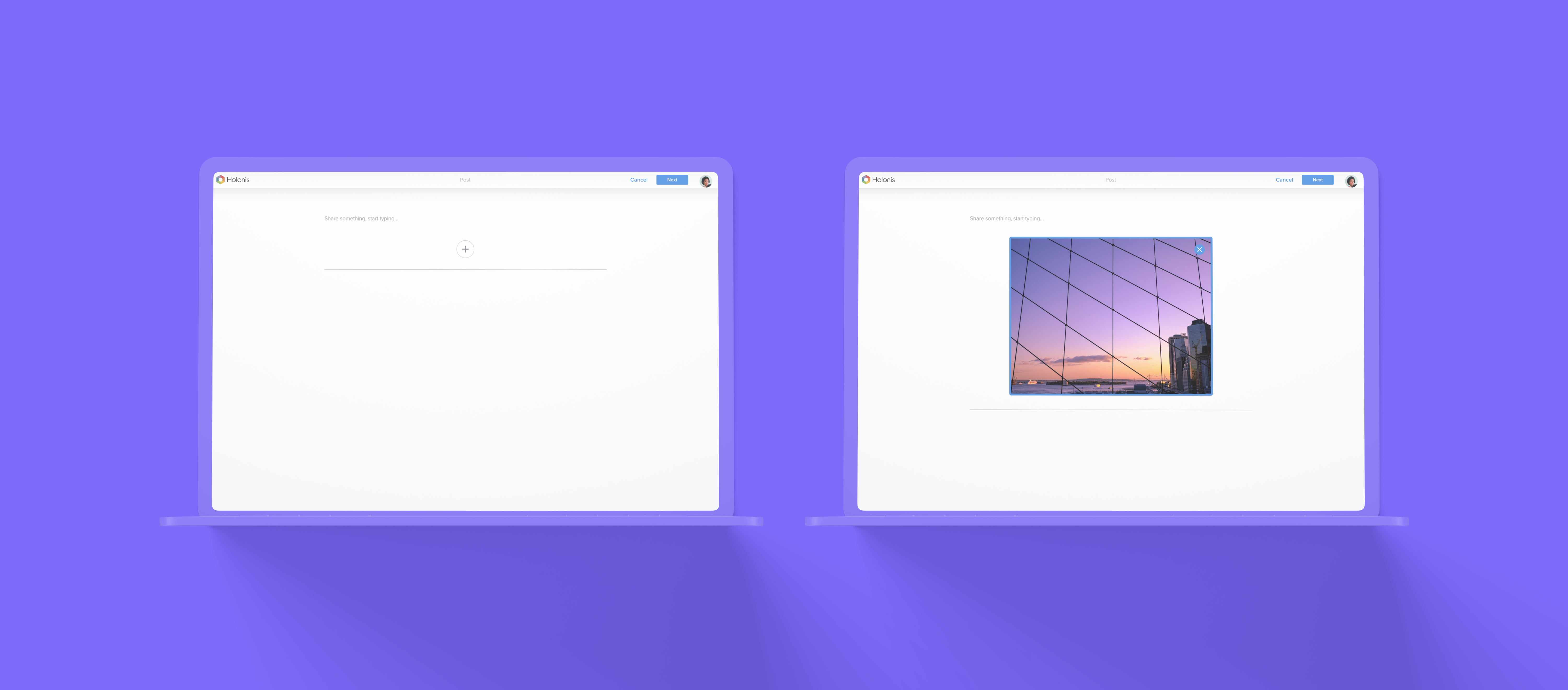
Approach 4: A post creation flow that looks and feels cohesive with the visual styles of the new news feed and the existing post modal (which is what you would see when you click on a post for more detail on desktop web). Visually and functionally similar to Approach 3, but simpler and without separate floating elements.
LAYOUT EXPLORATIONS (APPROACH 4)
After discussing with the team, we ultimately decided to go with Approach 4. We loved how intuitive it felt and how it better integrates the gallery editing experience. It definitely feels a lot simpler to not have to rely on modals (like in Approach 2) or have too many separate floating elements on the page (like in Approach 3). It was also most similar structurally to what we had before, and it was easy to make the design work with different screen breakpoints. This made the scope smaller and thus easier for our small front end development team to tackle, which was a huge plus.
05
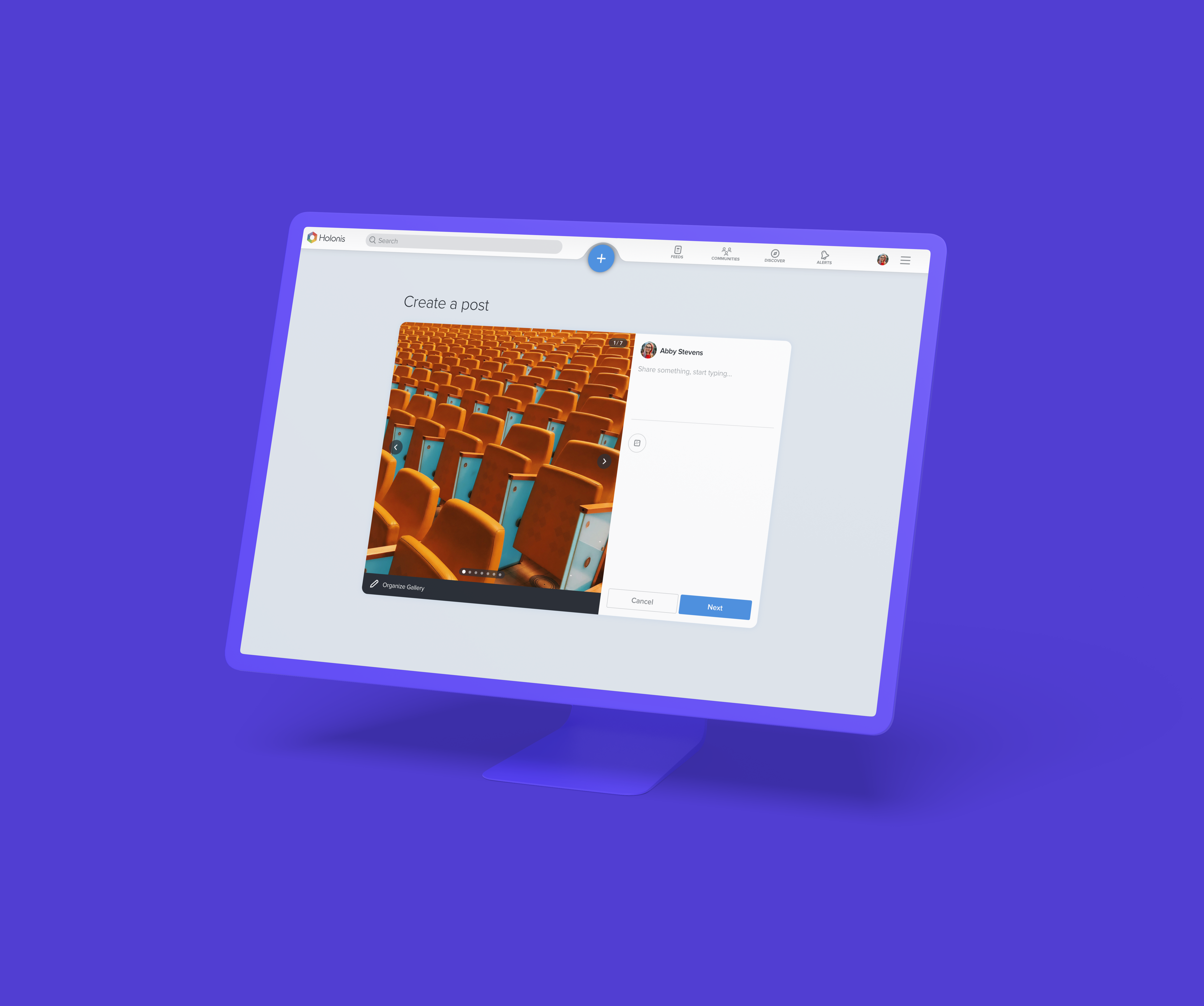
The Final Solution
The final visuals use our signature light grays and blues to match the new news feed, and as a result, the post creation flow no longer feels stale and empty. This visual refresh really helped bring our platform closer to looking cleaner and more modern.
Check out the final screens below!
06
Outcomes & Learnings
I would say the most difficult part of this project for me was working out how to best integrate the "Edit Gallery" feature into this flow. There were so many ways to go about it - was a pop up modal appropriate? An entirely separate page? Or was there a better way to integrate it into the current screen? Initially I was leaning heavily towards relying on modals for this solution, especially for the "Edit Gallery" feature; it seemed like it would be a great way to separate things without truly taking you away from what you were doing before. But after a lot of thought and feedback, I realized it could get complicated quickly. There would've been the initial "Create a Post" modal with the text field, the "Edit Carousel" modal, a modal for browsing for files to upload from your computer, and another if you wanted to click on a photo thumbnail and view it full screen...Modals on top of modals on top of modals would've been an overwhelming experience. It was much better to keep things simple.
Making sure this solution would work on multiple screen sizes was also a bit tough, especially since adding media would've meant there'd be less horizontal space for the text entry. Thankfully the design and sizing still looked fine on the tablet breakpoint, but looking back it might've been better if I had started by designing for the tablet screen size first to be safe. It's definitely easier to make a tablet-sized design fit desktop than it is the other way around.
This solution also has yet to be developed, but stakeholders and our product team were really excited about the visual revamp and multimedia gallery. Figuring out how to translate experiences from mobile native to desktop web is always challenging, but the outcome and the experience I gained were definitely worth it.