HOLONIS
Content Tile Redesign
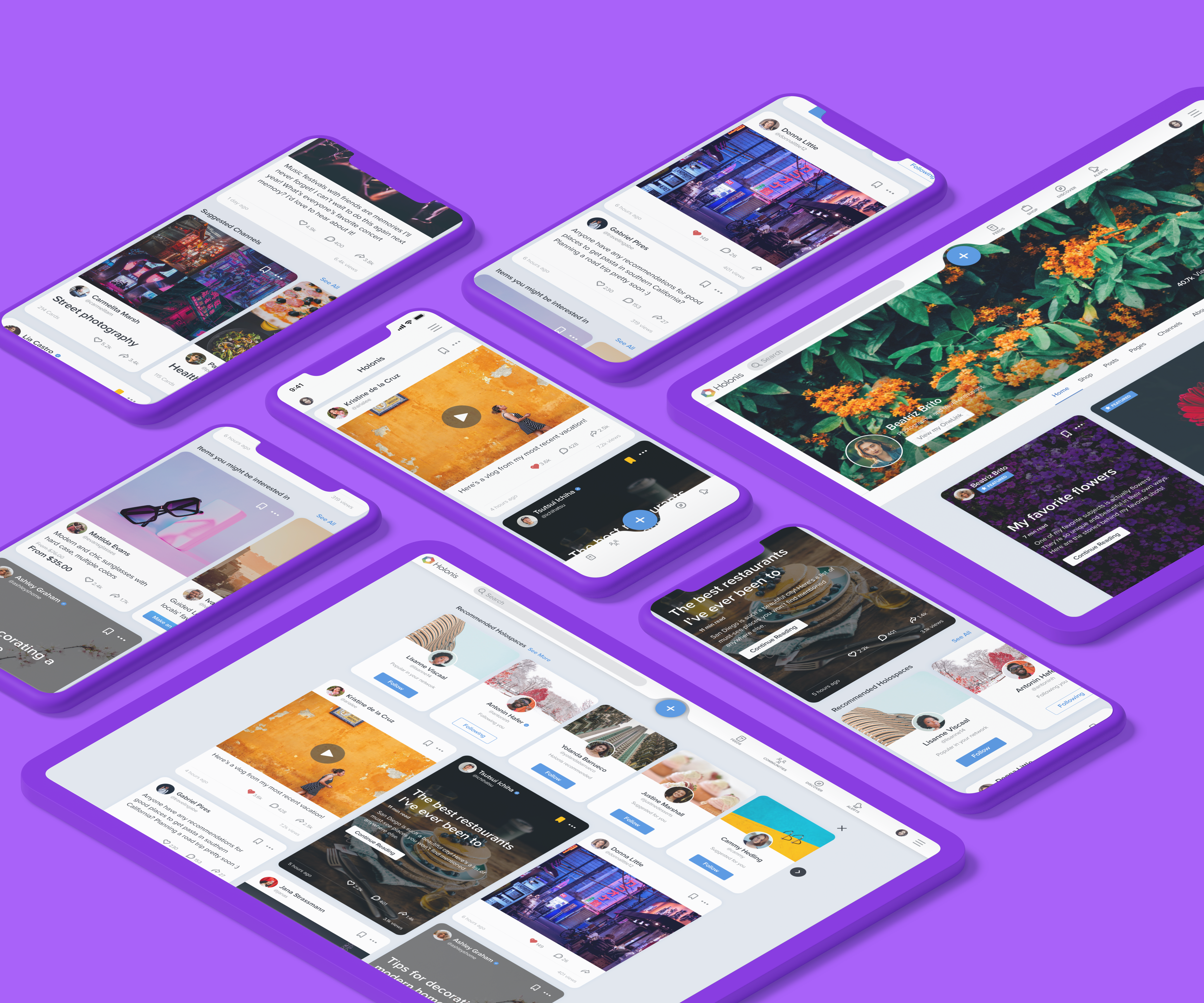
Holonis is a social media platform that lets anyone build their brand, connect with an audience, or enjoy content from their favorite creators. You can create a variety of content, including photo or text posts, pages (for longform content, such as blog posts or articles), channels (curated collections of content), and e-commerce products or services. You're able to view all content from people you follow on your news feed. For this project, I was tasked with redesigning the content tiles.

01
My Role
I was the main designer on this project, and I frequently received feedback and help from 2 senior designers, as well as other developers on the product team. I was responsible for doing competitive analysis, user flow, wire framing, and user interface design. This project was completed over the course of about a month. Unfortunately due to time and resource constraints, we were not able to do extensive user testing or research.
02
The Problem
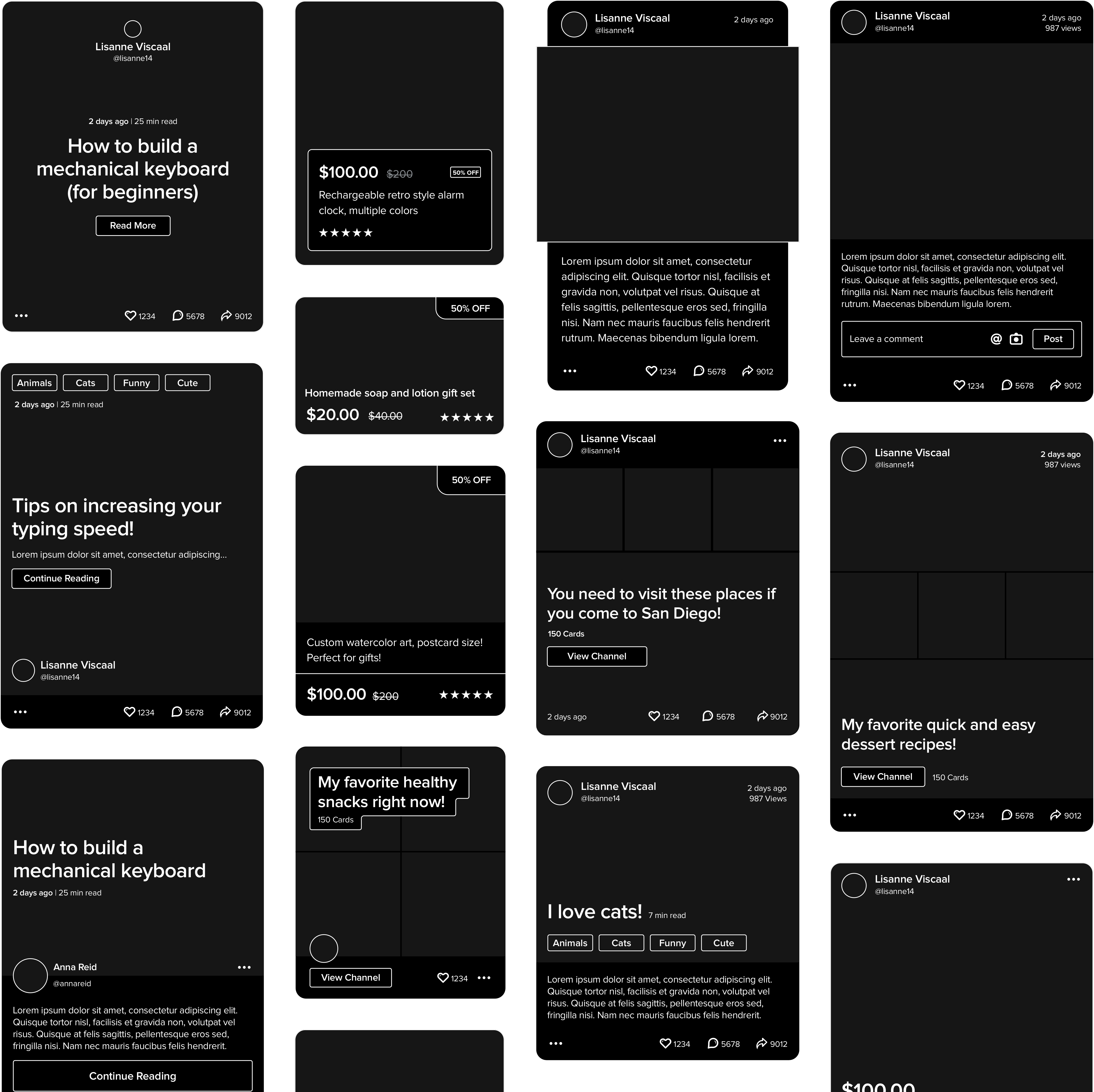
There were two main issues with how content was displayed in the feed. First, all content types looked basically identical. The main difference between each type was seeing the word "post," "page," "channel," or "product" in a small font towards the top of the tile. It was difficult to know what you were looking at right away and understand how you were supposed to interact with it. Second, the tiles had a dated visual design. They all had a light gray border, and the engagement bar at the bottom took up more space than necessary.
PREVIOUS CONTENT TILE DESIGNS | DRAG SLIDER UP TO COMPARE WITH UPDATED DESIGNS
03
The Goals
- Differentiate each type of content so that users will immediately know how to interact with it, as opposed to having to check a tiny label in the upper lefthand corner.
- Update the tile designs to be modern and fresh.
04
Explorations
I started with some competitive analysis, looking at similar social media platforms and paying attention to how they handled different content types on the news feed. Platforms that did this well made sure to format each type of post quite differently, so there is an immediate visual difference.
Following the competitor analysis, I designed a number of explorations for each type of content tile. At this phase, the sky was the limit; some of these explorations were closer to the original designs, while others were a bit more of a departure. In general, I wanted to figure out the best way to showcase each type of content. What would make sense to display for each type? For instance, maybe it would make sense to include the time it'll take to read through a page. For channels and products, I also played with the idea of displaying smaller versions of them in carousels interspersed throughout the news feed.
05
The Final Solutions
After doing quite a few rounds of exploring and consulting the rest of the design team, I chose a format for each type of content tile and worked on finalizing the visuals.
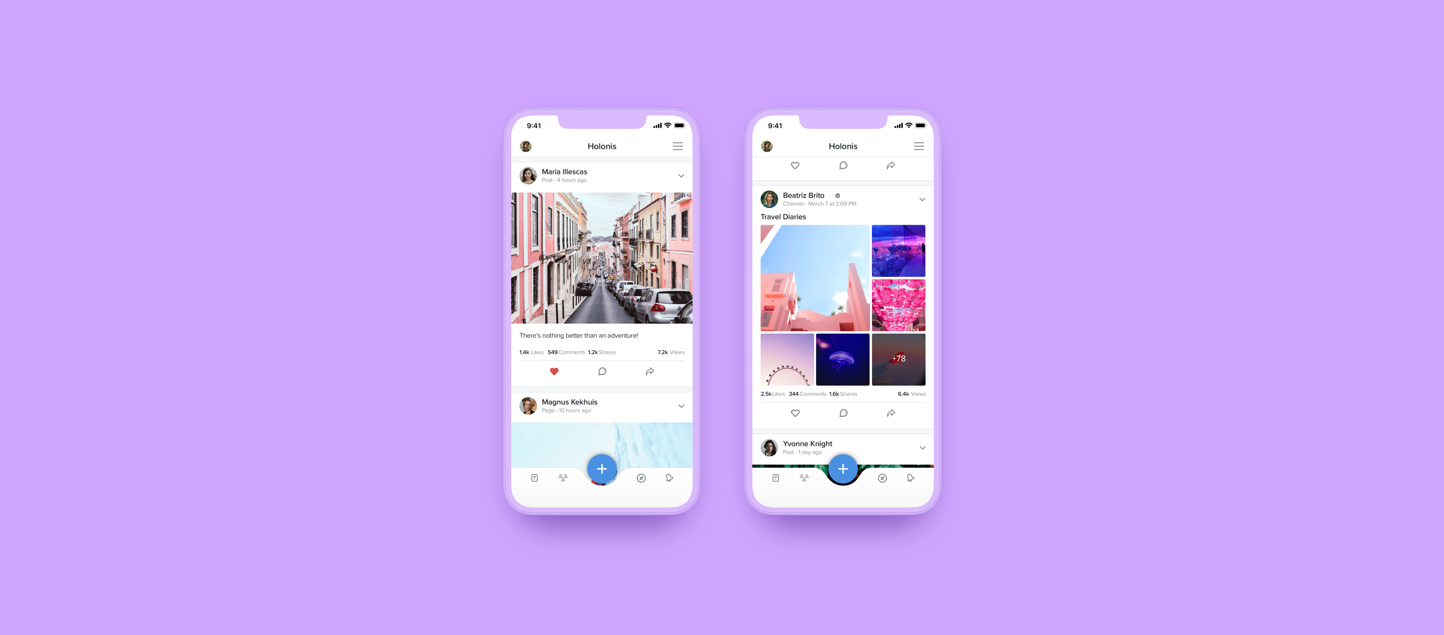
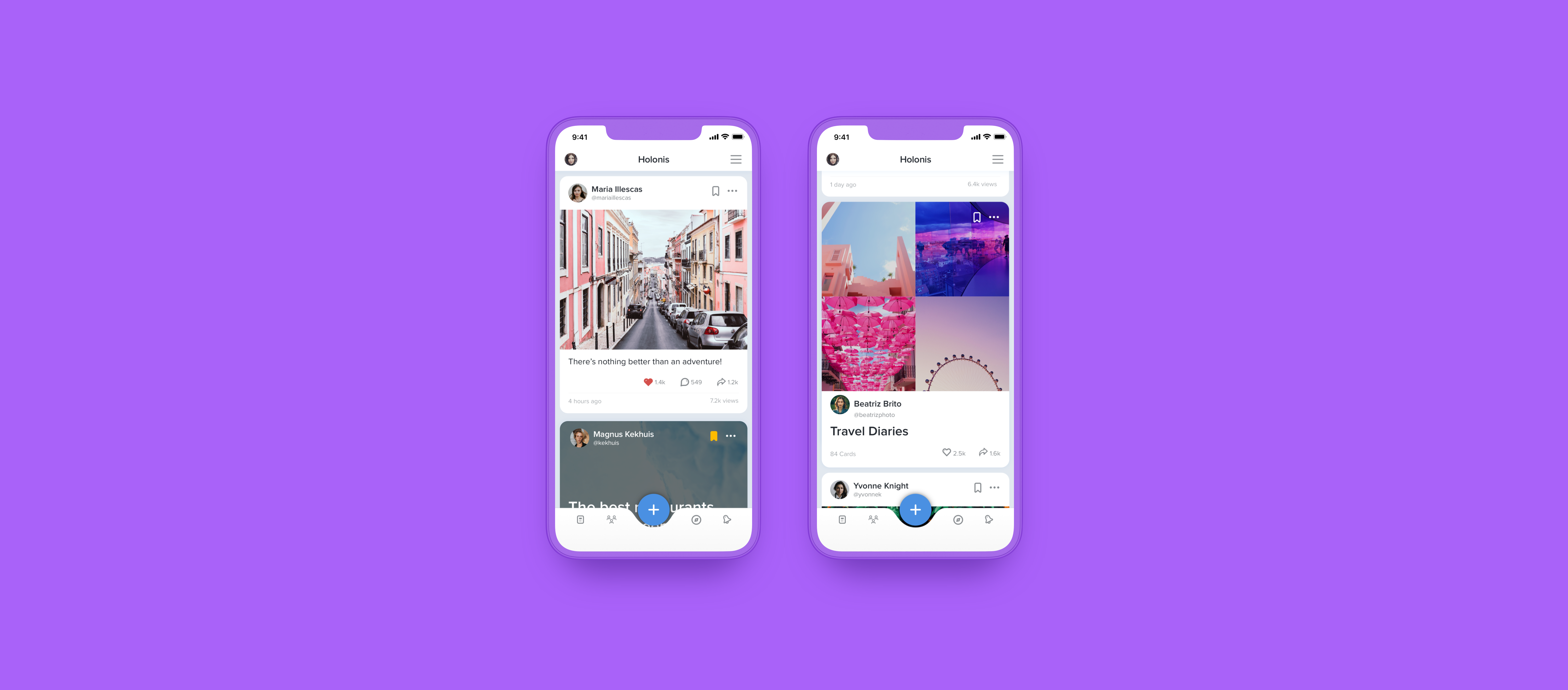
Since I wanted to make the visual design cleaner and more modern, I got rid of the gray borders, rounded the corners more, and simplified the engagement bar at the bottom to make things easier on the eyes. There's a slight drop shadow on every tile, and I changed the background color of the feed from a light gray to a very light blue so everything looked brighter and less stale.
05.1
Posts
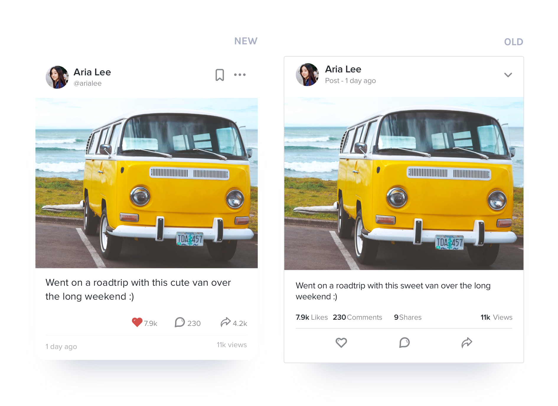
Posts are the go-to for short form content and could include any kind of media, including photos, videos, embedded links, and even shared content from Holonis.
As is, there wasn't much wrong with the way the post tiles were formatted; they put photos or text at the forefront, and it was pretty clear that you were looking at a post. There wasn't a need to reformat things drastically here, so I only had to update the styling.
I also added a bookmark icon in the top right corner for saving. Previously, it was buried in the overflow menu, but the team felt it made more sense to bring it to the forefront so people could save things more easily. This was also added to the final versions of the pages, channels, and products tiles.
05.2
Pages
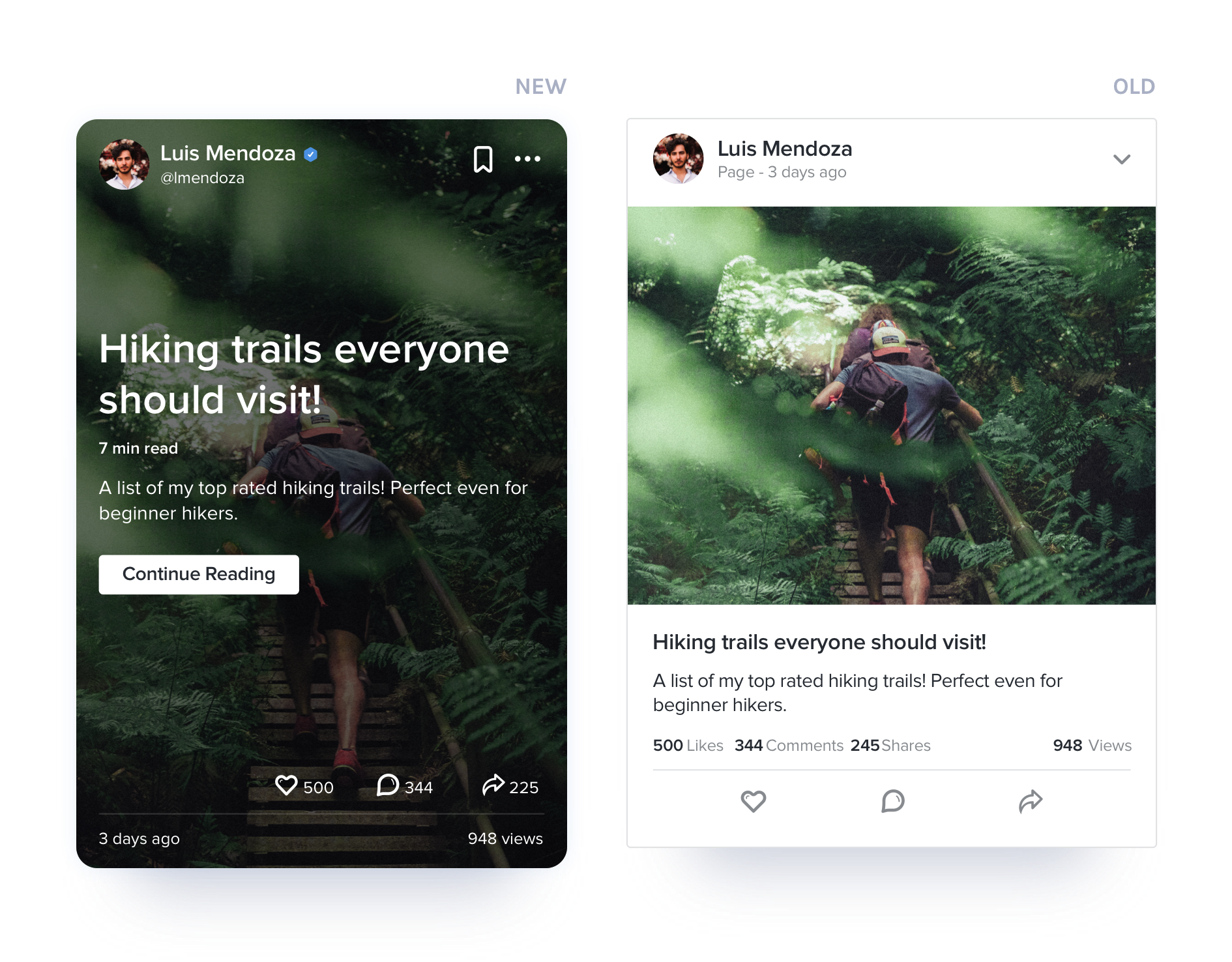
Pages are meant for long-form content, such as blog posts or articles.
Page tiles featured a cover photo, with a small title and short summary below. They looked incredibly similar to a post tile, however. It was almost impossible to tell if a page was really a page, as there was no "Read more" call to action that indicated there was more to be read when tapped.
When I redesigned this tile, I wanted to call out the title and summary more, similar to how articles on news sites and blogs are displayed. Imagery should be secondary and meant to supplement the title. I decided to use the cover image as the tile background, as opposed to showing it inline with the rest of the text. A "Continue Reading" CTA makes it more obvious it's a long-form article.
05.3
Channels
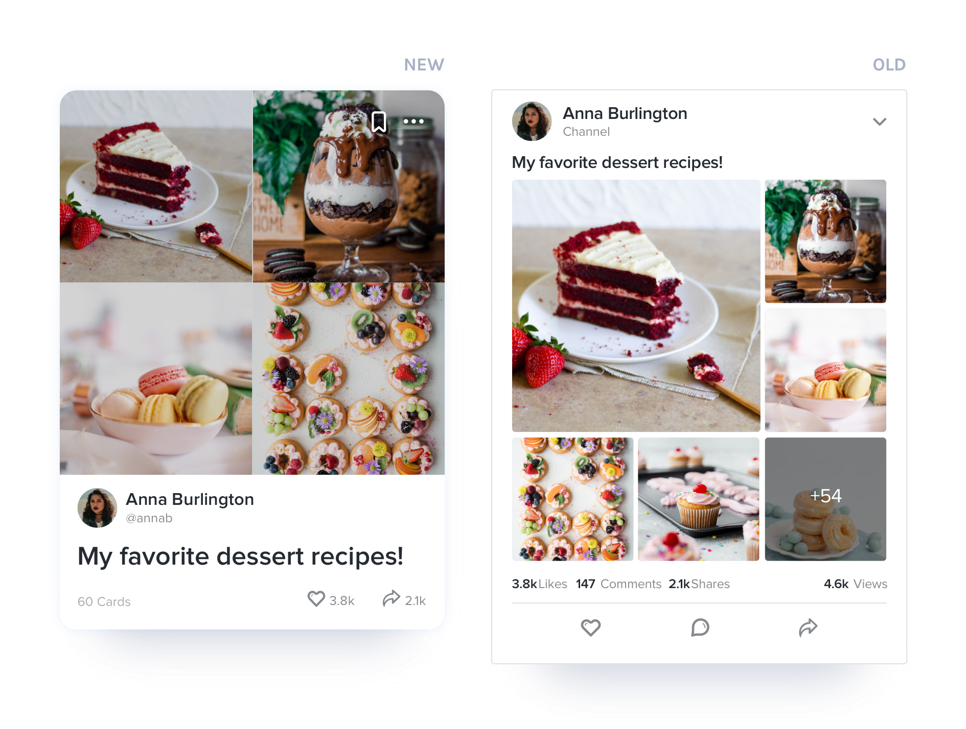
Channels are essentially collections of content from Holonis you can curate. You can put together channels featuring your favorite recipes, posts that inspire you, or whatever you'd like.
Again, the problem with the old design was that it looks too similar to posts and pages. The tile showed a small title at the top, with a collage of six images above, but it could easily be mistaken for a post with multiple photos. If you tapped on the tile, you'd be brought to a detail page that has all the content in the channel, but that wasn't quite obvious either.
For the redesign, I wanted the channel tiles to feel like a collection you'd view on sites such as Pinterest. Only four pieces of content are showcased (as opposed to six) at the top, so things are less overwhelming. They're also at the top of the tile, switching places with the user information, creating an emphasis on the content and a more obvious difference from other tiles.
05.4
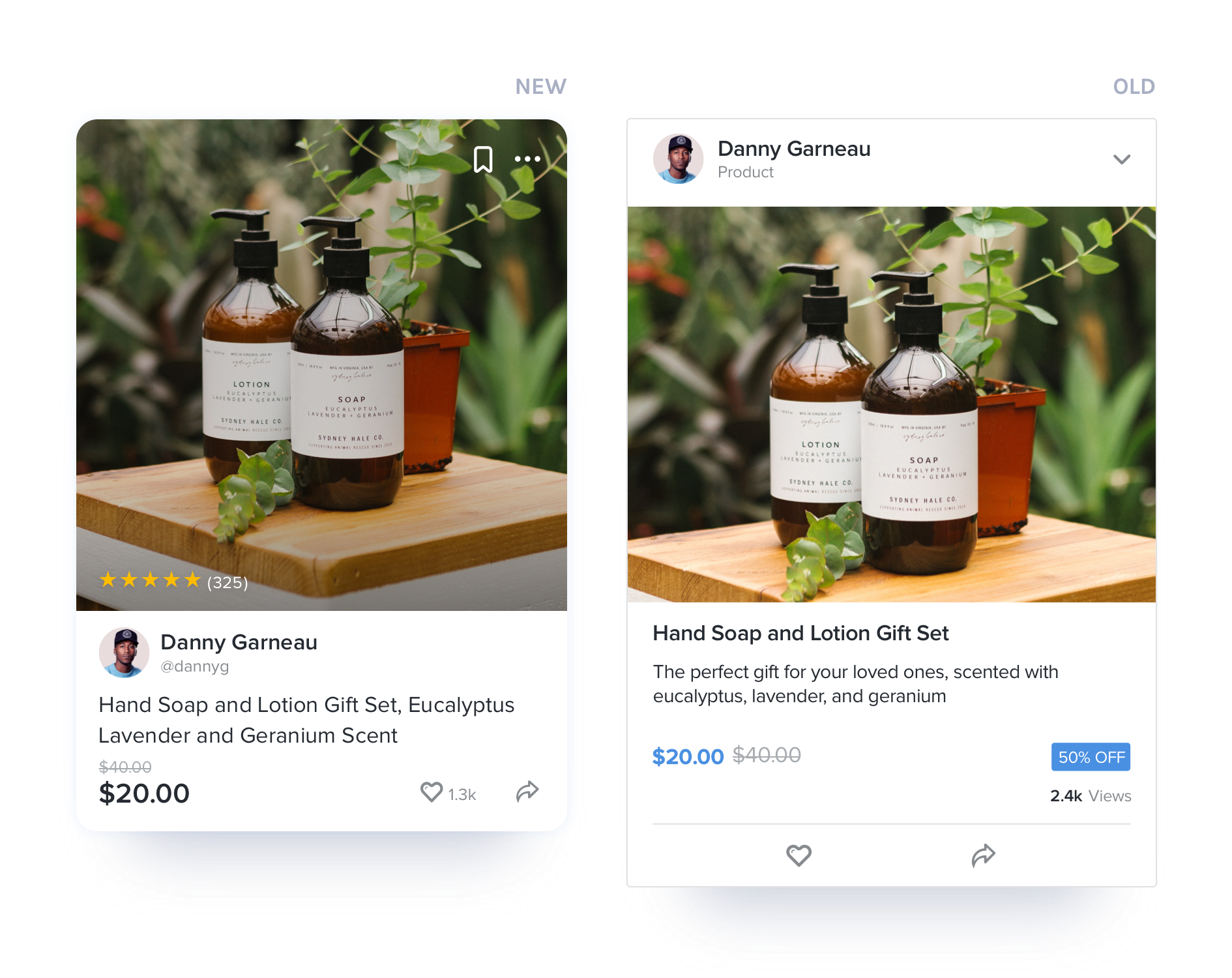
Products & Services
Anyone can sell their products or services on Holonis. The previous product/services tiles looked exactly like a post or page tile, but with a price featured at the bottom.
The new tile design features the product photo towards the top with the price still at the bottom, but now inline with the engagement icons. Even though the layout is similar to the Channel tile, we felt the single photo (vs four for channels) and the price by the engagement bar were enough to differentiate the two.
05.5
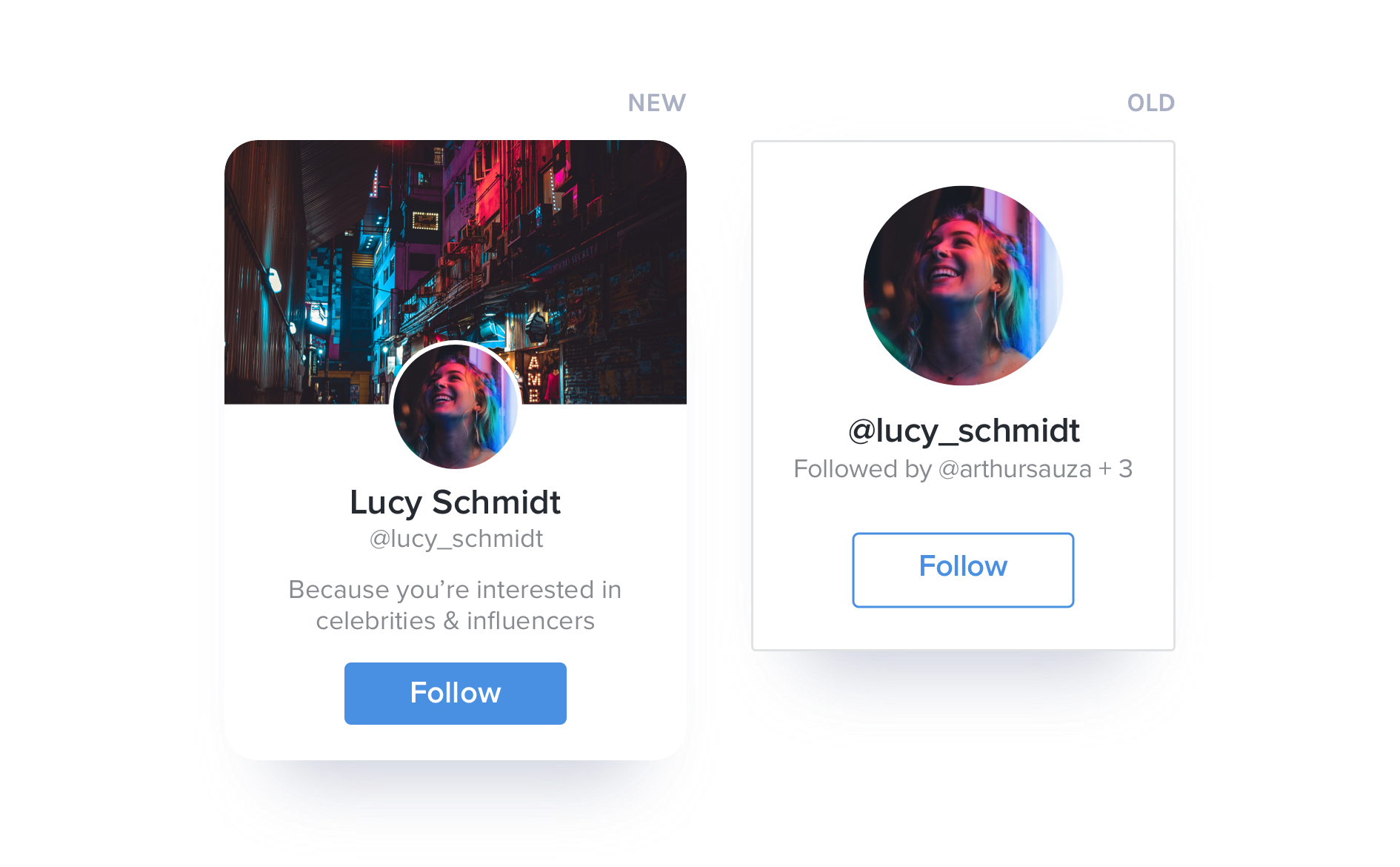
Holospaces
Holospaces are essentially user profiles; it's where everything a user has posted or shared appears. Recommended Holospaces are usually shown throughout the feed based off your interests and who you're following.
The main update to this tile was the addition of the header image from the user's Holospace at the top. I felt that including this would help show what was unique about each recommended user, which was already a bit difficult given the tile's smaller size.
06
Outcomes & Learnings
As a result of this redesign, more people felt that they were able to tell the differences between types of content much faster. The platform also felt a lot fresher than before, especially since the feed made up such a visible part of the app.
I learned so much from taking this project on. One thing I'd definitely do differently is to better consider how much space some tiles take up. There were a few revisions just for tile heights, but I think the page tile could especially be improved in this regard.
Another issue is being able to view all likes, comments, and shares from the engagement bar. With the old design, the number of engagements was separated from the icons, so all you had to do was tap one of the numbers to see all the likes/comments/shares. With the new design (on mobile, at least) you'd have to press and hold one of the engagement icons. Unfortunately, I didn't realize how unintuitive this was until it reached development, but being able to test with users probably would've uncovered this sooner.
I do really wish we had time to test the new designs with users before finalizing them and continuing with development, but unfortunately our timeline and resources didn't allow for it. All in all though, the content tile refresh was a great segue into rethinking the design of rest of the platform, as well as a fun and interesting learning opportunity.