HOLONIS
Communities 2.0 for Mobile Native
Holonis is a social media platform that lets anyone build their brand, connect with an audience, or enjoy content from their favorite creators.
Communities is a feature that lets users create a community page about a topic. Others can then join and share their own content about that topic. After our team created and implemented the initial MVP for the communities feature, it was my task to work on an improved 2.0 version for our mobile native app.
01
My Role
I was the main designer on this project, and I frequently received feedback and help from 2 senior designers, as well as other developers on the product team. I helped narrow down the list of features to be included in 2.0, and I was also responsible for doing competitive analysis, wire framing, and user interface design. This project was completed over the course of about a month and a half. Unfortunately due to time and resource constraints, we were not able to do extensive user testing or research.
02
The Problem
The Communities MVP was fairly barebones feature-wise, and 2.0 was a great opportunity to begin adding more functionality. Stakeholders had previously created a list of potential new features, and after taking a look and discussing with the design team and stakeholders, we had narrowed it down to a few to include in this version. Those features were: personalizing the community landing page, being able to sort all communities by category, and being able to sort content within individual communities. While there were more we would have loved to include, we felt that these would make the biggest immediate impact and also be the easiest to develop quickly.
The MVP had also limited who could create a new community to certain chosen influencers, but with 2.0 we would allow anyone to apply to create a community by submitting a form on the Holonis website.
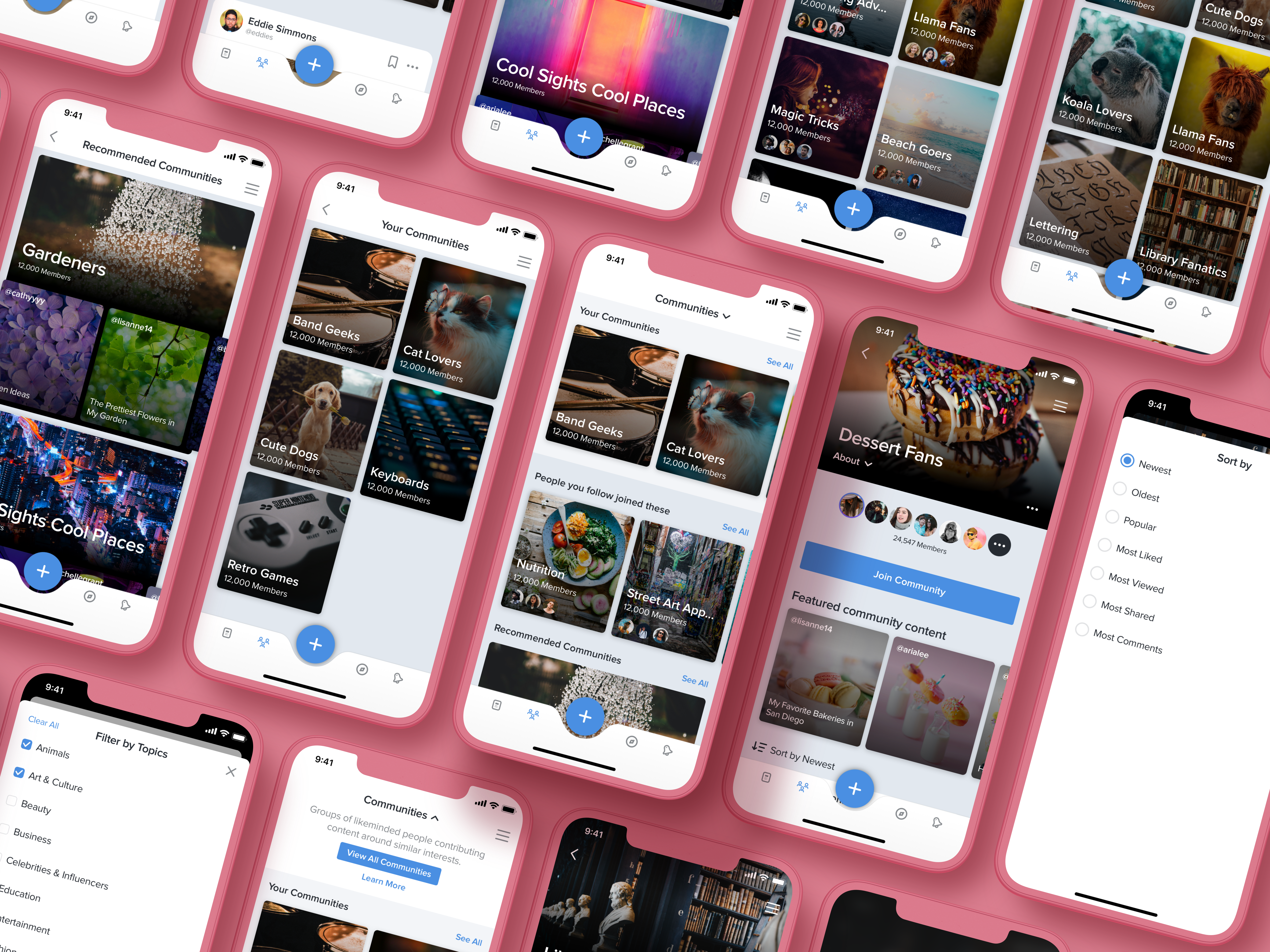
PREVIOUS MOBILE COMMUNITY DESIGNS | DRAG SLIDER UP TO COMPARE WITH UPDATED DESIGNS
03
The Goals
- Make the community landing page more useful and personalized by including sections where people can see what communities they have joined, what communities people they follow have joined, as well as recommendations.
- Create a new page for viewing all communities that would be accessible from the landing page. People will be able to filter all communities by category so it's easier to find and browse through new ones.
- Let people sort content in community detail pages so they can easily consume the content the way they want.
04
Explorations
Once we had our feature list, I started by doing some competitive analysis. I looked at other platforms to see how they handled group recommendations and category filters. I was greatly influenced by platforms like Facebook and Reddit when thinking about how to personalize the community landing page. The way user groups/subreddits are presented on both platforms is clean and easy to navigate, and finding new groups to join that were relevant to me was fairly effortless.
04.1
Improved Community Landing Page
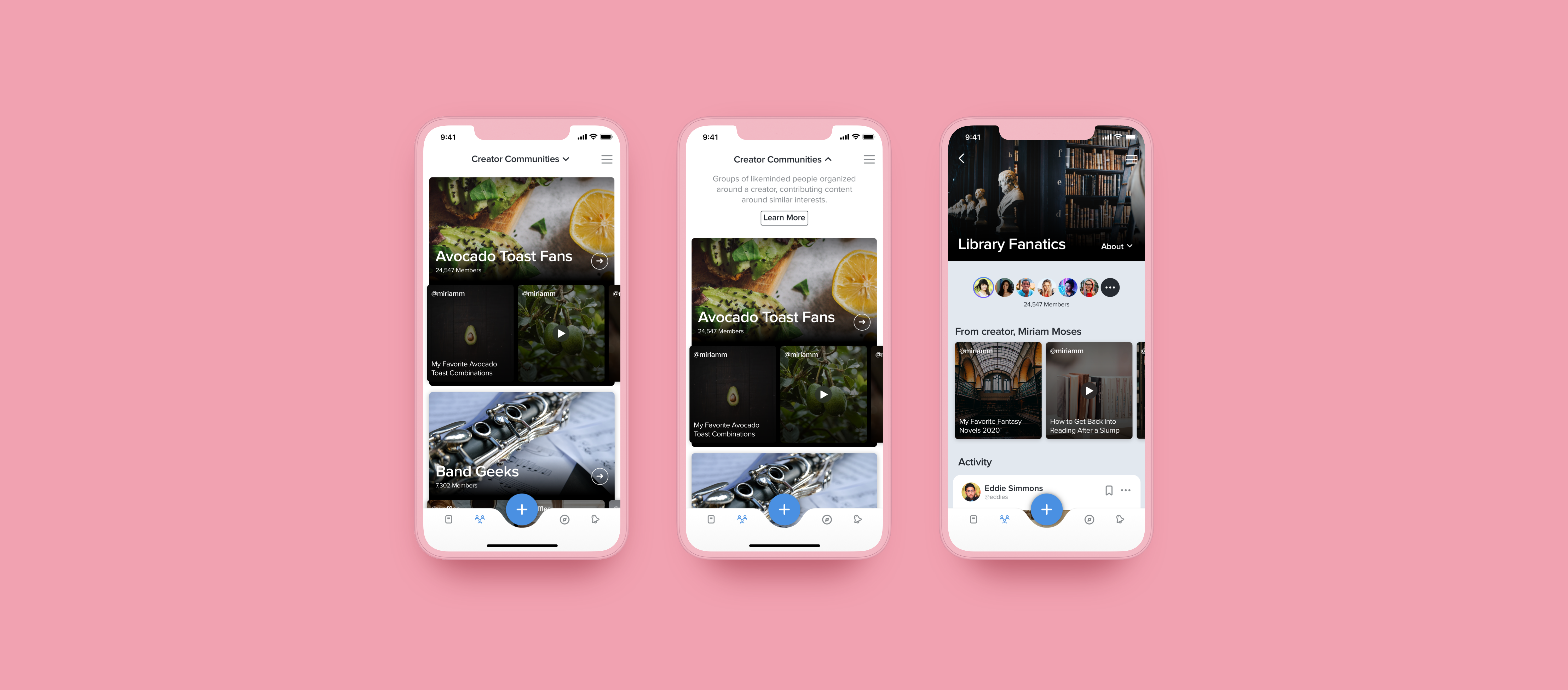
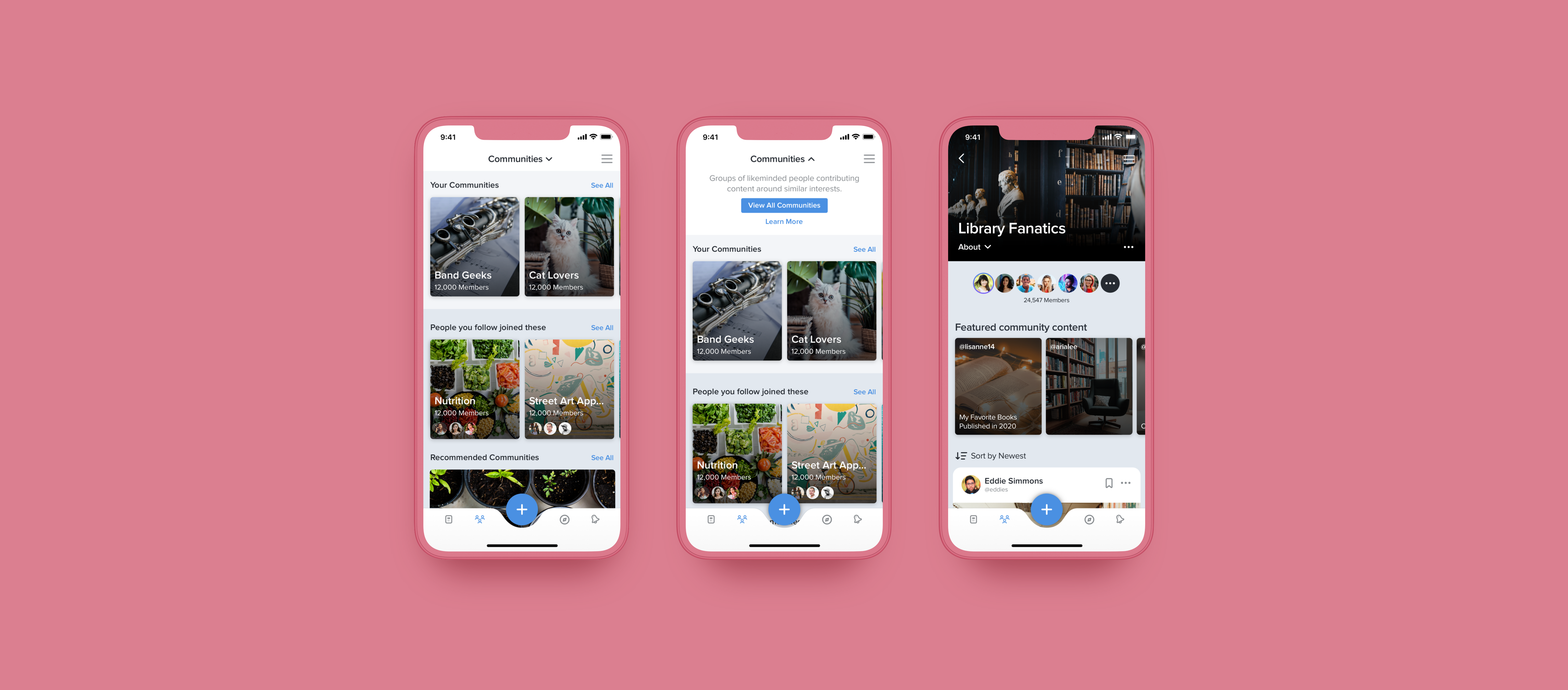
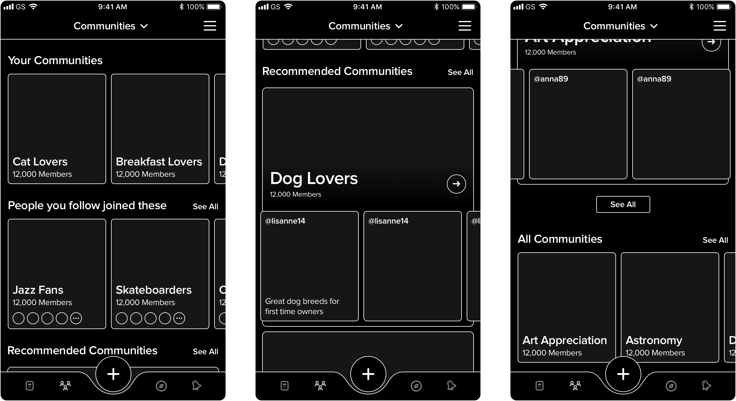
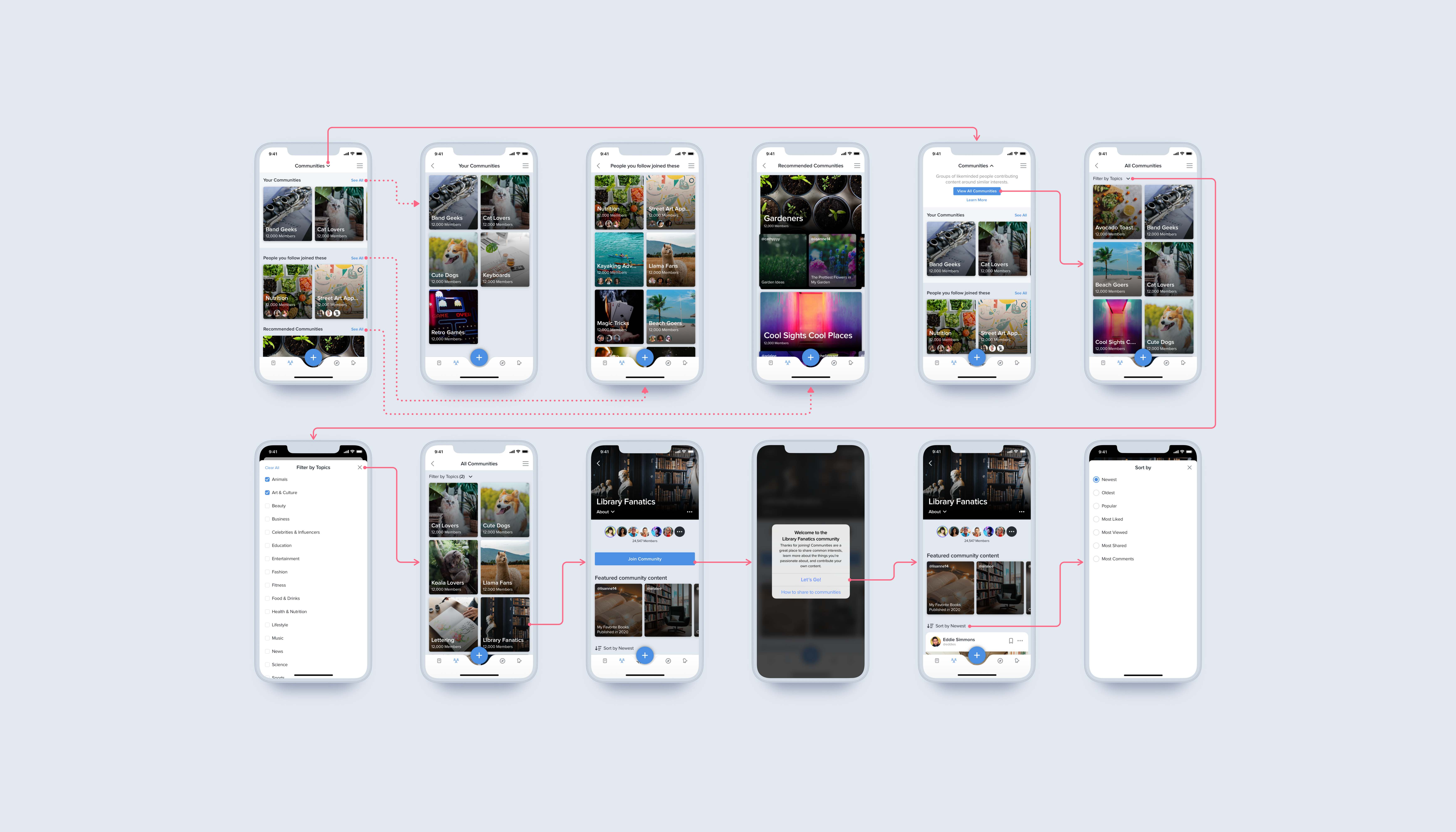
The MVP version of the community landing page was very basic and simply listed all of the communities available. For 2.0, we wanted to personalize this page more so that users could see the communities they've joined in addition to more tailored recommendations at a glance. I did this through adding sections for "Your Communities," "People you follow joined these," "Recommended Communities," and "All Communities." Over time we would've liked to add more relevant sections that would be more specific to the users' interests, but these felt like the right amount to start with.
Every section except for "Recommended Communities" feature a carousel that shows up to five communities, with a "See All" link to view all of the communities in that section on a separate screen. The "Recommended Communities" section retains the larger sized tile used in the MVP; since this tile also features content from the community, it's a great way for a potential member to preview what the community is about before tapping to view it in more detail.
COMMUNITY LANDING PAGE EXPLORATION
04.2
Filtering All Communities
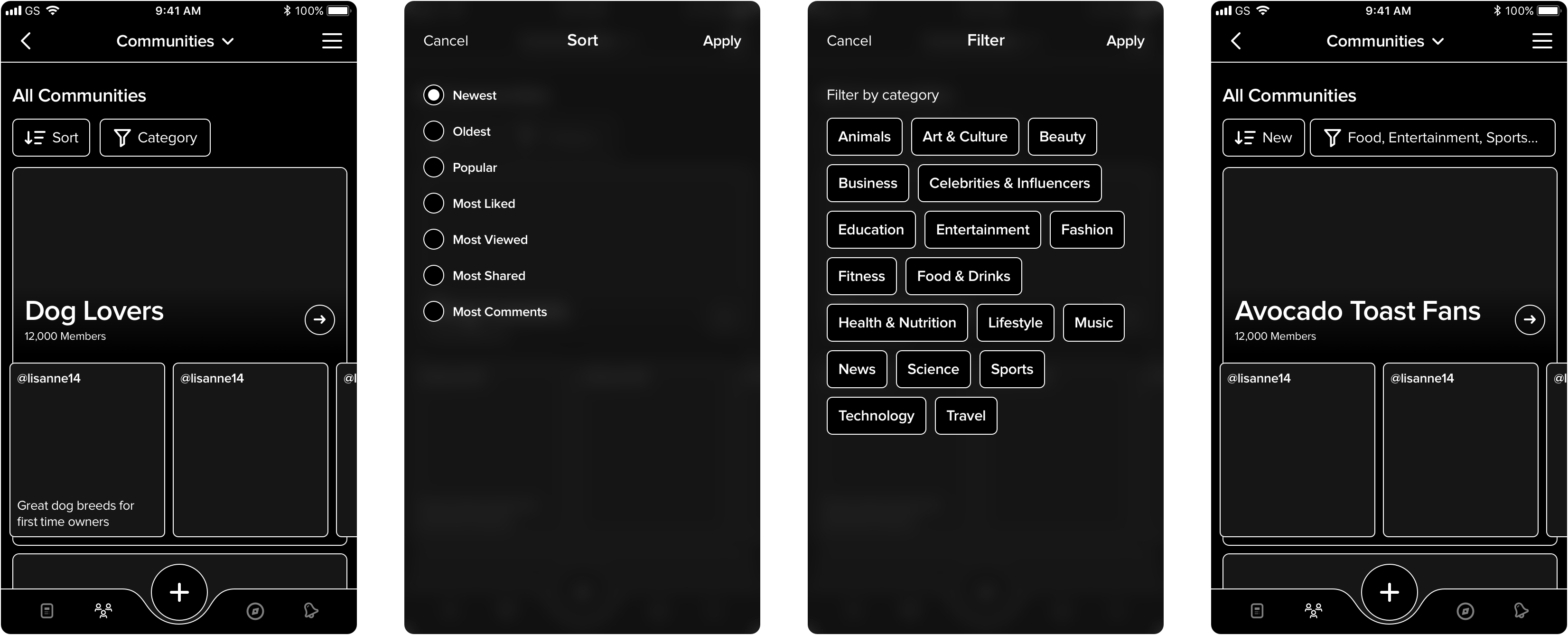
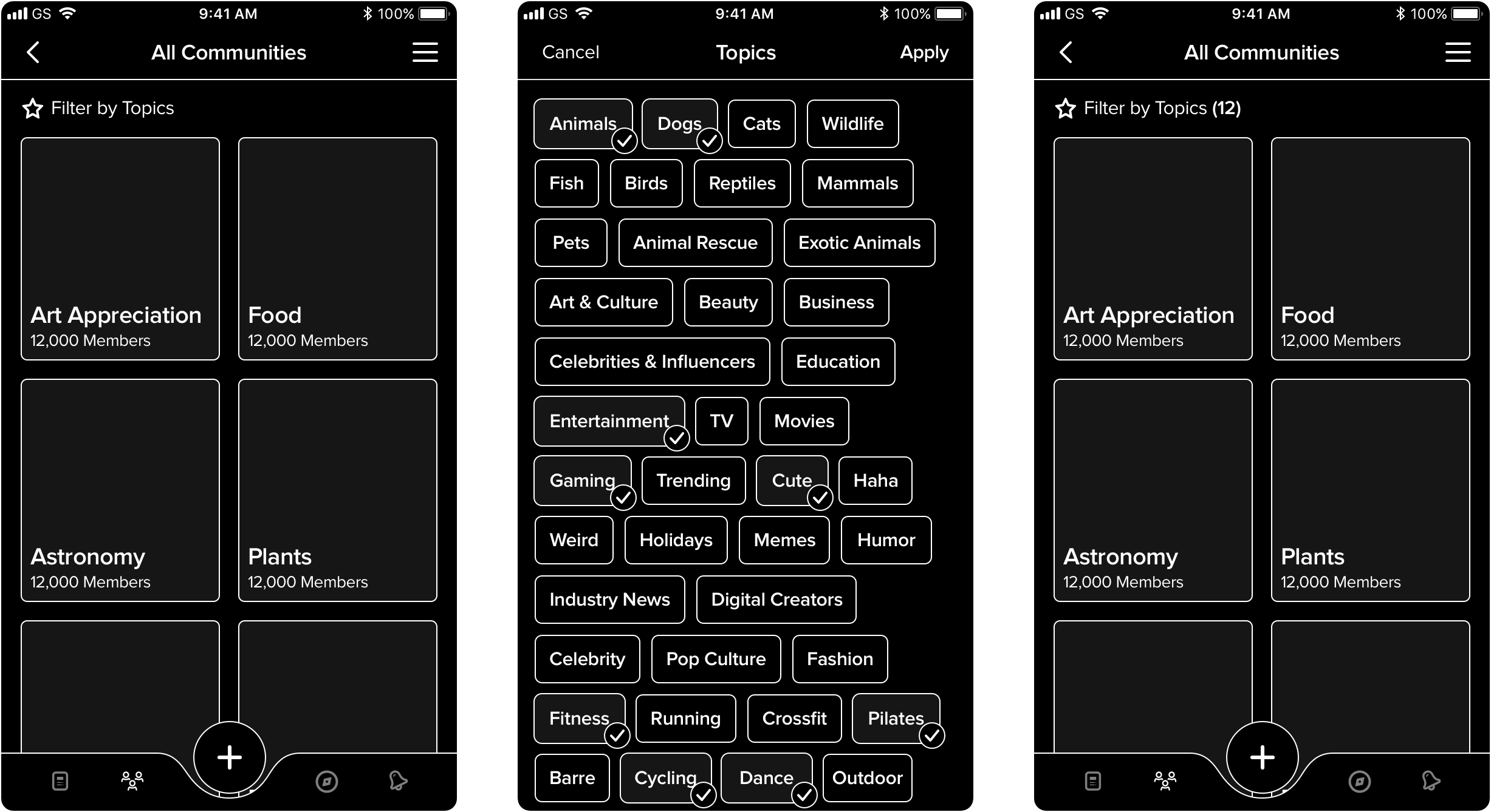
Tapping on the "See All" CTA for the "All Communities" section on the landing page will bring you to a screen featuring all the communities in alphabetical order. We wanted to separate the communities list from the landing page for two main reasons. The first was so that we could keep the landing page simple and more focused on more personalized recommendations. The second was so that we could add the ability to filter communities by category without worrying about cluttering up the landing page. (The team also originally wanted to have the ability to sort all communities by newest/oldest/etc, but it was ultimately decided against - the reason being that we didn't think it made sense to have the option to show new communities first, since they would likely be not as active.)
I explored a few variations for how to go about filtering communities. Essentially, there would be a "Filter by Topics" call to action that would open the topics list in a full screen modal, where the user can select as many topics as they would like. They would then see what they have selected once back on the "All Communities" screen, towards the top. We were deciding between showing the actual category names as tags at the top or just including the number of categories chosen, and we and opted for the latter to keep things cleaner.
COMMUNITY FILTERING EXPLORATION (APPROACH 1)
COMMUNITY FILTERING EXPLORATION (APPROACH 2)
04.3
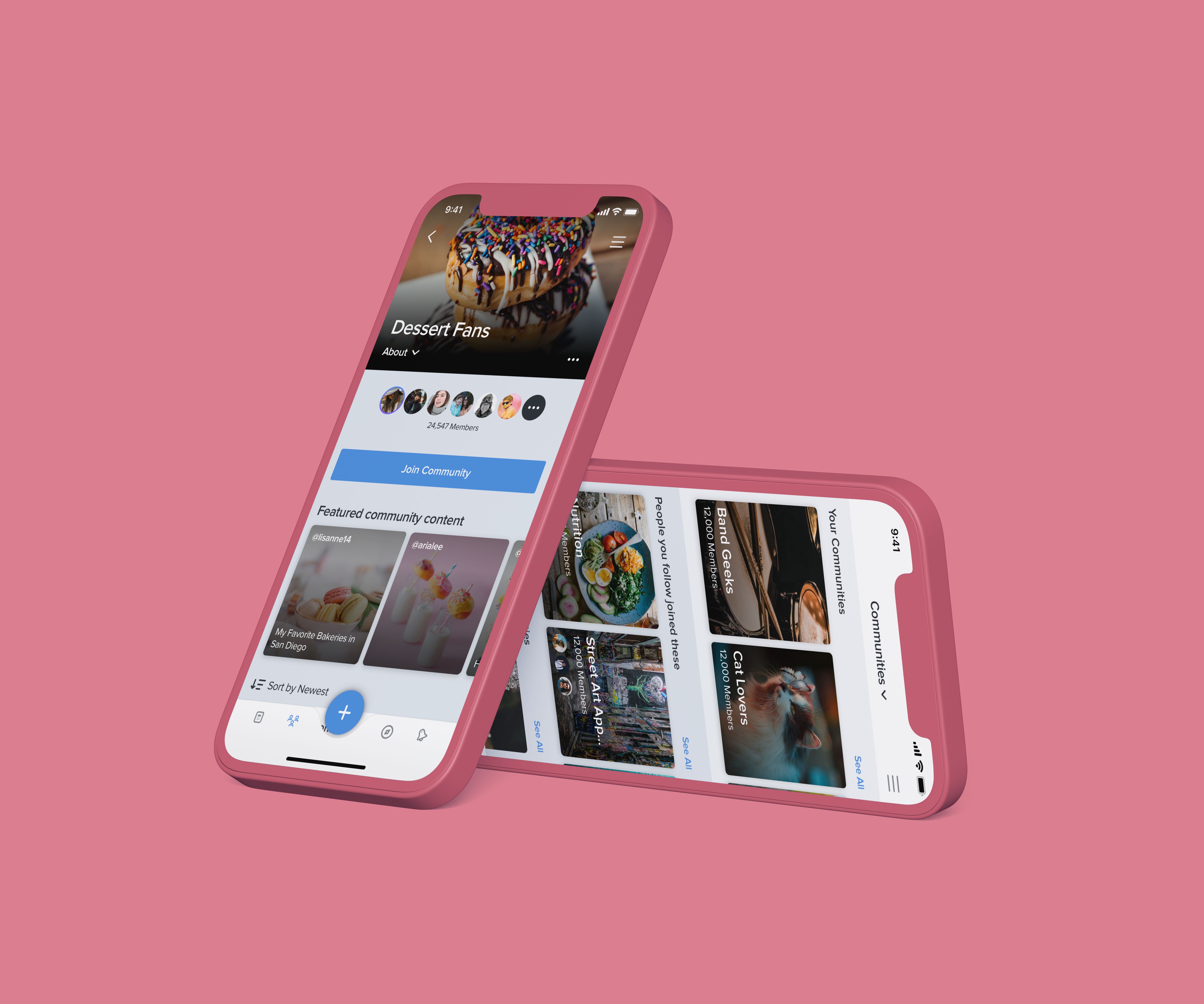
Community Detail Page
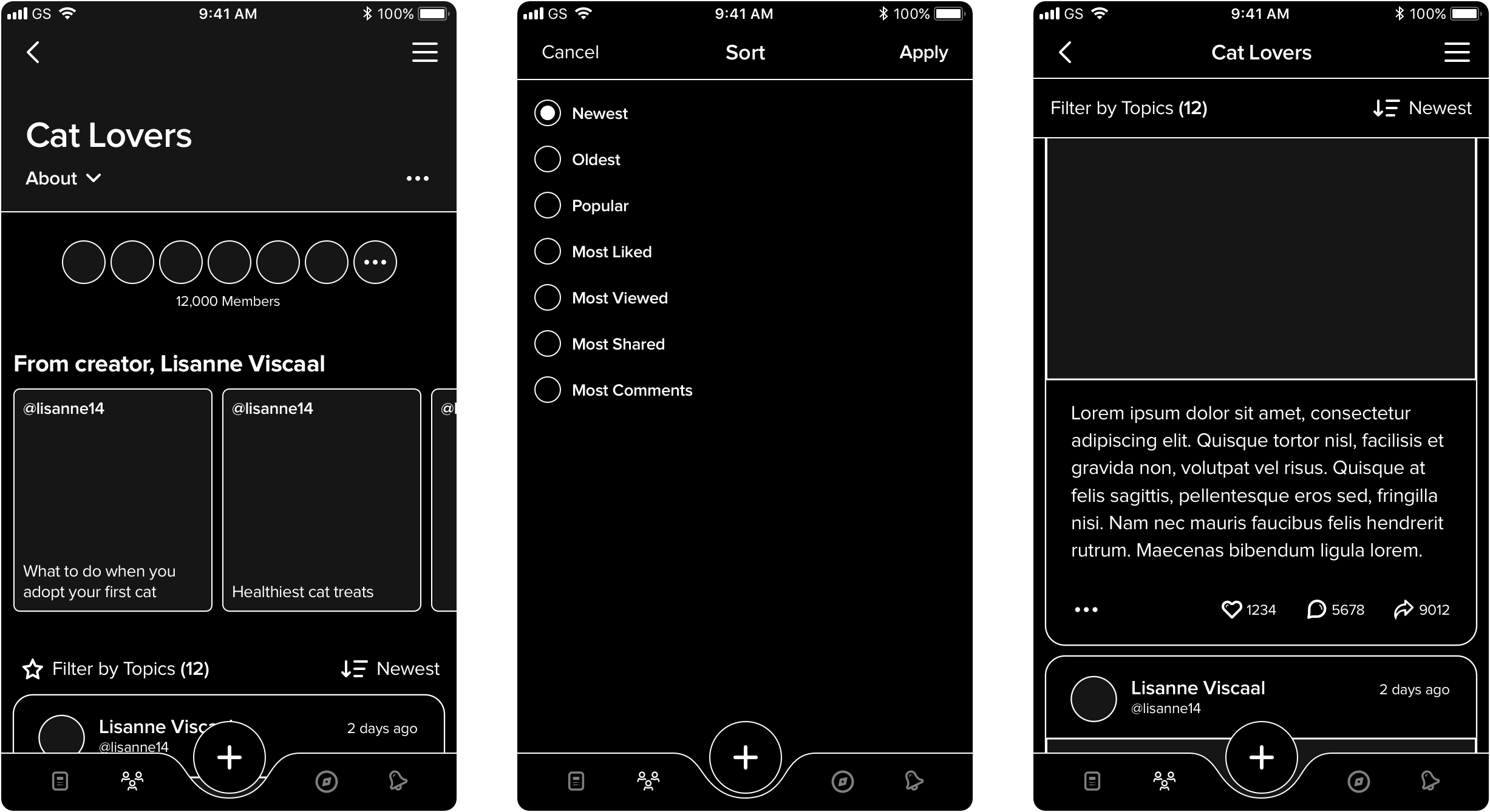
The community detail page remained largely unchanged, but we did add the ability to sort member content from newest, oldest, most popular, and more, so that people can have more control over how they want to consume content. We originally meant to include the ability to filter posts by category as well, but in the end we felt it wouldn't make as much sense, since most content in a given community will likely be in the same category anyhow.
COMMUNITY DETAIL PAGE EXPLORATION 1
05
The Final Solution
After rounds of discussion and stakeholder approval, I then worked on the final UI designs. The only main change was the removal of the “View All Communities” carousel at the bottom of the landing page. The team felt it was a bit out of the way and might seem inconvenient to get to, so instead I integrated a "View All Communities" CTA at the top of the page, as part of the drop down that explains what communities are. This keeps it out of the way when you want, but you can easily access it no matter how far you've scrolled down.
Check out the final screens below!
06
Outcomes & Learnings
After getting to work on the desktop designs for the Communities MVP earlier, I was very excited to be able to work on the 2.0 version. I was eager to add more features, though I didn't expect that deciding which to include and convincing others of their usefulness would be one of the more challenging parts of this project. There were quite a few features that ended up not making the final cut; some of these were giving people the ability to invite others to a community, as well as being able to easily create a new community (as opposed to having to submit an application to admin to have it approved). I would've loved to tackle these as well if I were given more time.
Although Communities 2.0 still has yet to be implemented, the design team and stakeholders were pretty satisfied with these revisions; they were good improvements to the user experience without having to take too much development time, as well as a fun learning opportunity.