HOLONIS
Communities 2.0 for Desktop Web
Holonis is a social media platform that lets anyone build their brand, connect with an audience, or enjoy content from their favorite creators.
Communities is a feature that lets users create a community page about a topic. Others can then join and share their own content about that topic. I previously worked on the improved 2.0 version for the mobile native app, which included a more personalized landing page, category filters for communities, as well as the ability to sort community content. Afterwards, I was responsible for creating the desktop web counterpart.

01
My Role
I was the main designer on this project, and I frequently received feedback and help from 2 senior designers, as well as other developers on the product team. I was responsible for doing competitive analysis, wire framing, and user interface design. This project was completed over the course of about a month and a half. Unfortunately due to time and resource constraints, we were not able to do extensive user testing or research.
02
The Problem
After finishing the designs for Communities 2.0 on mobile, it was now time to translate that experience over to desktop web. Carrying over the landing page and detail page design changes to desktop looked like it would be fairly straight forward. On the other hand, carrying over the ability to filter all communities by category seemed a bit more challenging. Because there's more screen real estate on desktop web, there were a couple of different ways we could have integrated this feature, so I needed to figure out what would suit our platform best.


PREVIOUS MVP DESKTOP COMMUNITY DESIGNS | DRAG SLIDER UP TO COMPARE WITH UPDATED DESIGNS
03
The Goals
- Revise the community landing page design for desktop, which would include the new sections we added on mobile: "Your Communities," "People you follow joined these," and "Recommended Communities."
- Design a separate "All Communities" page and figure out the best way to filter all communities by category.
- Add the ability to sort content on the community detail page.
04
Explorations
When doing the competitor analysis for this project, I made sure to keep in mind the differences between the mobile and desktop counterparts of different platforms, such as Facebook. I also really liked the way Behance and LinkedIn approached sorting and filtering content by using a number of dropdown menus. It was clear there were quite a few ways to go about it after looking at many platforms, so I made sure to keep these approaches in mind while starting wireframe sketches.
04.1
Improved Community Landing Page
Redesigning the community landing page layout wasn't too complicated; a lot of elements like the header image and text stayed the same, and the "Your Communities" section uses the same white background from the community detail pages. The carousels do use smaller tiles like on mobile, and the "Recommended Communities" section reuses the larger tile from the MVP version. The "View All Communities" button at the bottom of the page would later be moved to the header in the final version of the layout.

COMMUNITY LANDING PAGE EXPLORATION
For the "All Communities" page, I explored two different layouts just to see how they might feel. The first (on the left) had all the communities in rows and in alphabetical order, while the second (on the right) would have communities separated by category and in carousels. There was a bit of back and forth about these options, but in the end we just decided to stay with the simple list in alphabetical order.
While separating communities into category carousels seemed like a great way to browse and discover communities, there were a few issues. The biggest was that because this was such a new feature, we simply might not have enough communities to populate the entire page, or even populate an entire carousel. Also, separating all the communities by category with such a small amount of categories would basically render the filtering feature useless. In the end, this seemed like it would be more useful once communities had more traction in the future rather than right now.
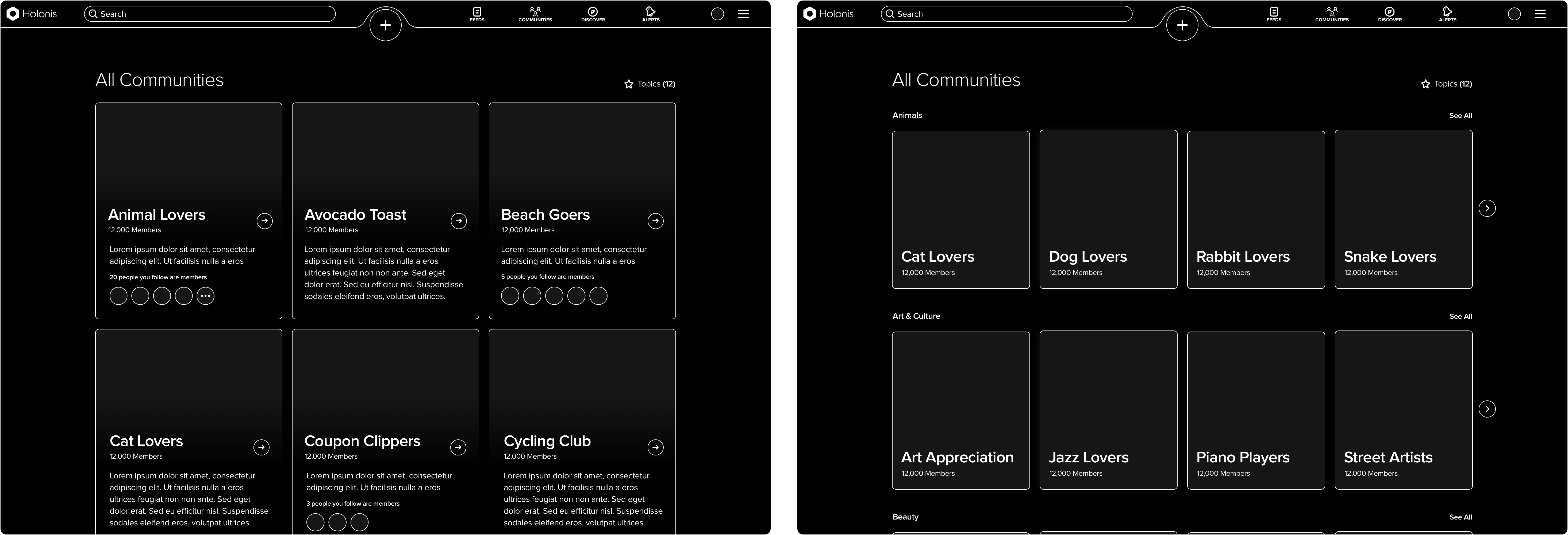
"ALL COMMUNITIES" PAGE EXPLORATIONS
04.2
Filtering All Communities
I played around with quite a few approaches for category filtering on the "All Communities" page to see what would make the most sense for us, but the following three were the most compelling.
Approach 1: A "Topics" CTA in the upper right that opens up a modal where the user can select all the categories they want to filter by. After saving and closing the modal, the selected categories will appear as tags under the "All Communities" title. Clicking on a tag will delete the category.

COMMUNITY FILTERING EXPLORATION (APPROACH 1)
Approach 2: A "Topics" CTA in the upper right that opens a dropdown menu where the user can select checkboxes next to all the categories they would like to filter by. The categories list will update automatically every time a category is checked or unchecked.

COMMUNITY FILTERING EXPLORATION (APPROACH 2)
Approach 3: A search bar with "Search All Communities" text above the list of communities. This would function differently from the global search bar, however, and will only find relevant categories. After typing in categories and pressing enter, the category names with a delete icon will appear above the communities list.

COMMUNITY FILTERING EXPLORATION (APPROACH 3)
As a team, we ultimately decided to go with Approach 2, which uses the dropdown menu, as it was the most uncomplicated and straightforward solution in the end. Although Approach 1 was fine, we felt it could potentially be jarring to be taken out of the current experience when the modal opens. The category list was also not that long, so using a modal for this seemed a bit unnecessary. Additionally, having the category tags in full view on the "All Communities" screen could also look cluttered if the user had selected a large number of them.
I also spent quite a bit of time exploring Approach 3, which was inspired by an older version of Behance's search function. We believed it had the potential to make categories easier to find if the user knew what they were looking for, but we actually ended up overlooking a big issue in the process. The main problem concerned what would happen if the user searched for a category that didn't exist. Currently, there is a set amount of categories; users cannot tag their content or communities with whatever category they want - they must choose from our curated list. If we tried to solve this problem by simply offering suggestions for the closest relevant category, it would feel overcomplicated and confusing - especially if a user didn't know what our categories were in the first place. In the end, we realized this idea would function better if we could allow users to tag content or communities with whatever they wanted in the future. Although even then, it would probably be best to just integrate that feature into the global search function, rather than have a dedicated search bar on the "All Communities" page.
04.3
Community Detail Page
The community detail page also remained largely unchanged. I did explore potentially including the category filter here, but it was ultimately scrapped again to keep things simple and more like the mobile version. In the end, the main change was the addition of the sorting dropdown menu, which lets users sort the community content from newest, oldest, most popular, and more.
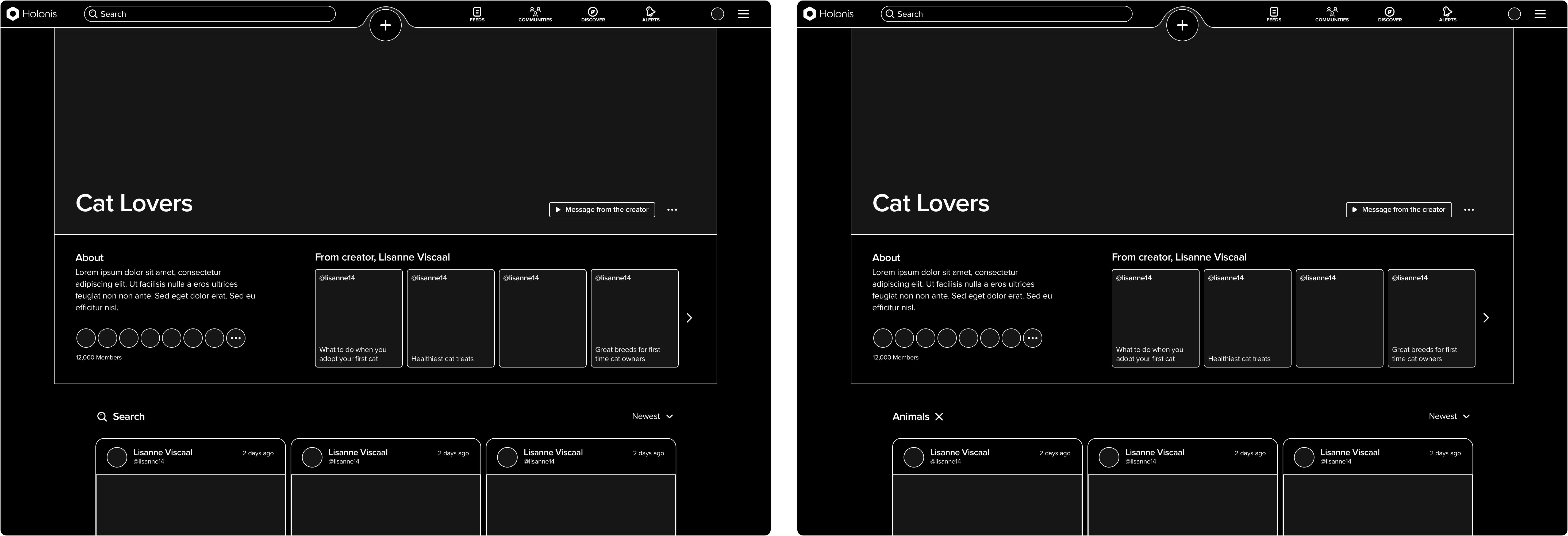
COMMUNITY DETAIL PAGE EXPLORATION 1 (WITH SEARCH)
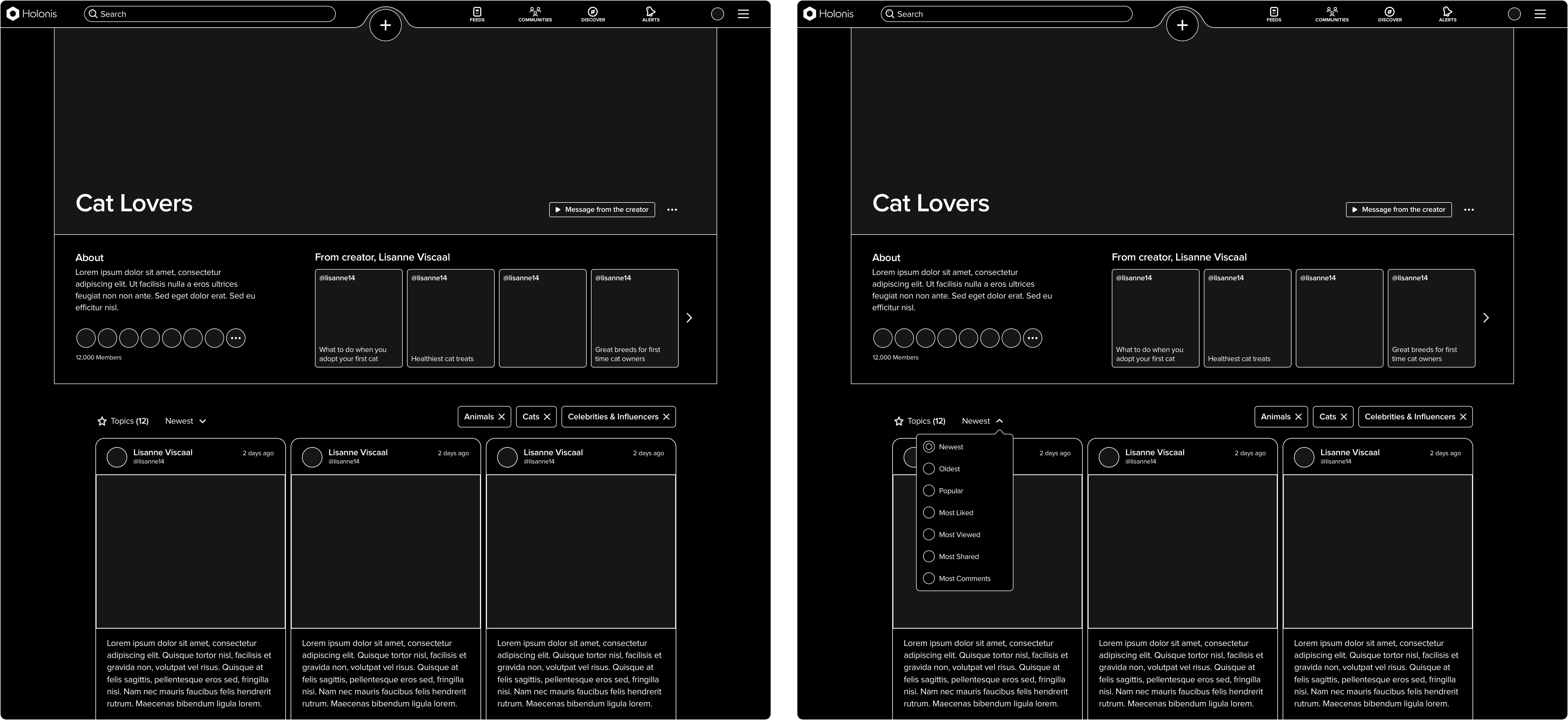
COMMUNITY DETAIL PAGE EXPLORATION 2 (WITH DROPDOWN MENU)
05
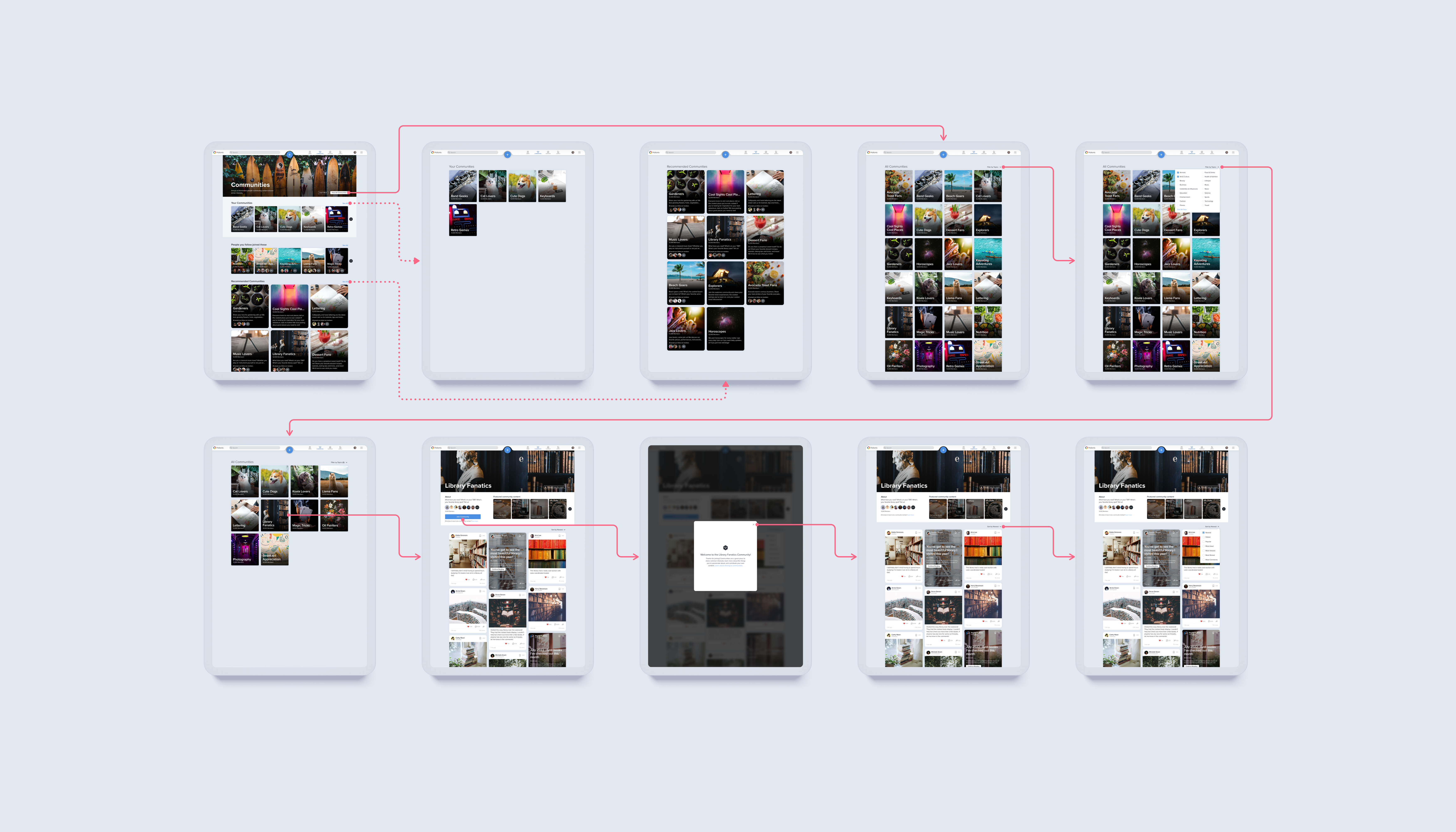
The Final Solution
The finalized layouts went through very few changes, apart from moving the "View All Communities" CTA to the landing page header to better match the mobile app. I also made a few subtle changes to the community tiles, adjusting the spacing and rounding the corners more to better match the content tiles on the news feeds I had worked on previously.
Check out the final screens below!
06
Outcomes & Learnings
Working on this project was a really fun challenge! I actually didn't anticipate how challenging redesigning the category filter would be for me. There was definitely a lot of back and forth about how that feature should work and how we could better adapt it to desktop. I really wanted to take advantage of how much more flexible desktop web could potentially be, but I ended up making things a bit more complex than I meant to. Less really is more; in the end the dropdown menus work perfectly fine, and I do wish I realized that sooner. That being said, I'm still glad I was able to take the time to explore a lot of potential solutions. Even though many ideas were scrapped in the end, being able to explore them fully was what helped me realize why they wouldn't have worked out as well as I had hoped. It's definitely better to figure that out sooner rather than later.
The desktop web version of Communities 2.0 also has yet to be implemented, but we were quite happy with the improvements we had made. We definitely felt that these updated screens would make a bigger and better impact on how users interact with communities in the future.
